Revo UI is MIT licensed and can be used in commercial applications under that license. Its public repository includes the library source and component gallery.
Meet Revo UI: Components for Dashboards and Business Apps
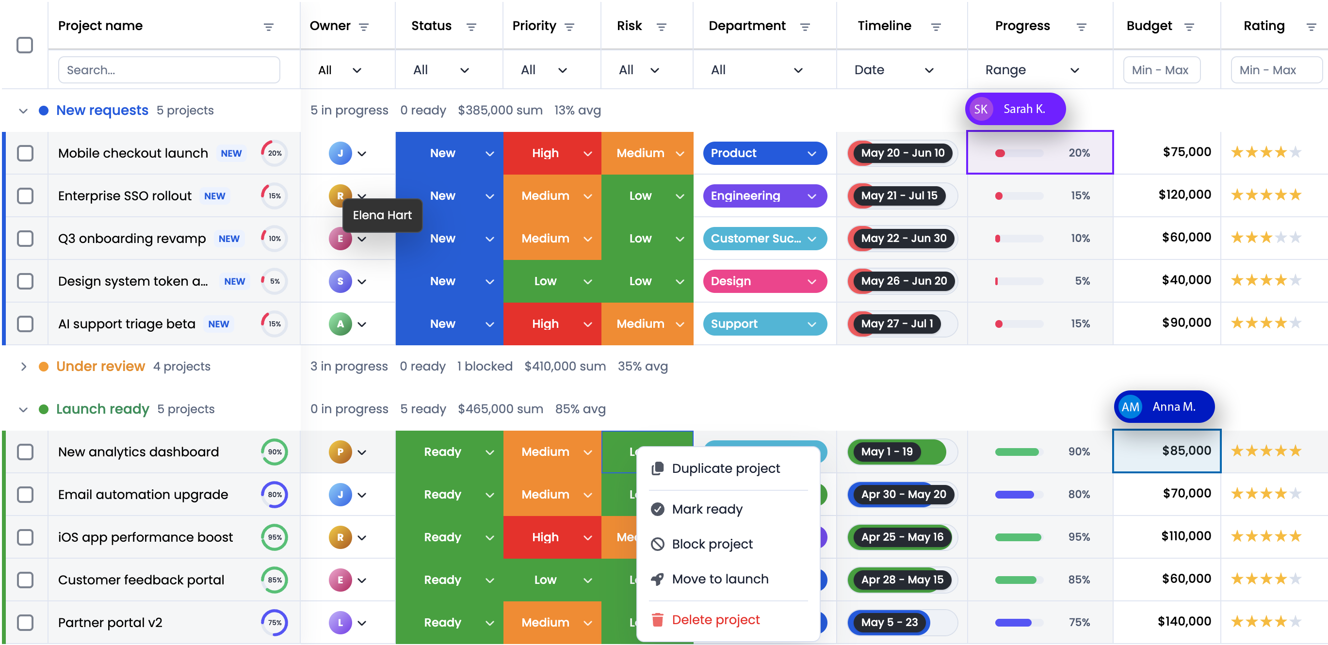
An invoice dashboard needs a search field, status filters, totals, and a way to inspect individual records. A project workspace adds dates, assignees, dialogs, and availability controls. Each part should feel like it belongs to the same application.
We built Revo UI to provide those building blocks. It is an open source UI component library for financial applications, reporting dashboards, and project management tools, available as @revolist/ui.
Revo UI supports React, Vue, Angular, Svelte, Preact, and vanilla TypeScript. You can use it independently or alongside RevoGrid, while keeping application state and business rules in your own code.
What does Revo UI provide?
The component gallery groups controls by the work they support. Start with the part your screen needs, then combine it with the rest of your application.
| What you are building | Components to explore |
|---|---|
| Search, filters, and data entry | TextInput, SearchInput, NumberInput, Dropdown, Combobox, MultiSelect |
| Dashboard summaries | BarChart, LineChart, AreaChart, BrushRange |
| Date and availability workflows | DatePicker, DateRangePicker, TimeInput, TimeGrid, TimelineTrack |
| Task details and configuration | AssigneePicker, DurationField, Dialog, Tabs, SplitLayout |
| Document review | PdfViewer and PdfViewerToolbar |
| AI interfaces | AiChat, AiPromptInput, AiSuggestions, AiTask |
| Actions and feedback | Button, Badge, Alert, EmptyState, ProgressBar |
Some components have additional integration needs. The PDF viewer uses PDF.js and needs a compatible worker. The AI components supply the interface for messages, prompts, and task states; your application connects them to a model or backend. The weekly time grid edits availability, with scheduling rules and persistence supplied by your application.
Who is the library for?
Revo UI is useful for product and frontend teams building screens where users inspect information and then act on it.
In a financial application, that might mean filtering transactions, checking a chart, and opening a supporting document. In a reporting dashboard, it might mean selecting dates, adjusting filters, and moving between summary and detail views. In a project management tool, it might mean assigning people, changing dates, and reviewing weekly availability.
It is also useful when related applications use different frontend frameworks. The adapters let each application keep its framework's state and composition patterns while sharing the library's controls and styling.
Install Revo UI
The examples below use @revolist/[email protected]. For the tested Vite setup, install:
bash
npm install @revolist/[email protected] [email protected]In this release, Vite's dependency optimizer also resolves the package's optional PDF viewer assets. Installing pdfjs-dist avoids that resolution error even when the example uses no PDF component. No PDF worker setup is needed for the examples in this article. The complete starter includes the pinned dependencies.
Import the shared stylesheet once in your application entry point, before your own overrides:
ts
import '@revolist/ui/styles.css';Then import components from the adapter for your framework. For example, a React application uses @revolist/ui/react and its existing react and react-dom dependencies. You do not need to install the other framework adapters as separate packages.
A working React example with real components
Open the weekly planner in its own tab.
This React adaptation of the Revo UI gallery's weekly planner combines TimeGrid, Avatar, Checkbox, ProgressBar, Legend, and SegmentedSwitch. Pick a team member, select two-hour blocks, and mark priorities complete. Reset restores the selected person's sample week. On narrow screens, scroll the time grid horizontally to see later hours. The downloadable starter includes the complete code, photos, and layout styles.
tsx
import { useRef, useState } from 'react'
import {
  Avatar,
  Badge,
  Button,
  Checkbox,
  Legend,
  ProgressBar,
  SegmentedSwitch,
  TimeGrid,
} from '@revolist/ui/react'
import { timeGridCellKey } from '@revolist/ui/time-grid'
import alexPhoto from './assets/alex.jpg'
import samPhoto from './assets/sam.jpg'

// Adapted from the Revo UI gallery's weekly planning example.
const days = ['Monday', 'Tuesday', 'Wednesday', 'Thursday', 'Friday', 'Saturday', 'Sunday'].map(
  (long, index) => ({ weekday: (index + 1) % 7, short: long.slice(0, 3), long }),
)
const members = {
  alex: { name: 'Alex Morgan', role: 'Product designer', photo: alexPhoto },
  sam: { name: 'Sam Rivera', role: 'Frontend engineer', photo: samPhoto },
}
type Member = keyof typeof members
const priorities = [
  'Prepare the weekly review',
  'Protect time for deep work',
  'Share a progress update',
]
const defaults = (member: Member) =>
  new Set(
    (member === 'alex'
      ? [
          [1, 8],
          [1, 10],
          [2, 10],
          [3, 8],
          [3, 10],
          [4, 14],
          [5, 10],
        ]
      : [
          [1, 10],
          [2, 8],
          [3, 10],
          [4, 8],
          [5, 14],
        ]
    ).flatMap(([day, hour]) => [timeGridCellKey(day, hour), timeGridCellKey(day, hour + 1)]),
  )

export default function UiQuickStart() {
  const [member, setMember] = useState<Member>('alex')
  const [schedules, setSchedules] = useState<Record<Member, Set<string>>>({
    alex: defaults('alex'),
    sam: defaults('sam'),
  })
  const [completed, setCompleted] = useState<Record<Member, string[]>>({
    alex: [priorities[0]],
    sam: [],
  })
  const [focused, setFocused] = useState('1:8')
  const matrixRef = useRef<HTMLDivElement>(null)
  const cells = schedules[member]
  const person = members[member]

  function toggle(day: number, hour: number, selected: boolean) {
    setSchedules(current => {
      const next = new Set(current[member])
      for (const h of [hour, hour + 1])
        selected ? next.delete(timeGridCellKey(day, h)) : next.add(timeGridCellKey(day, h))
      return { ...current, [member]: next }
    })
  }

  return (
    <main className="planning rv-ui">
      <div className="planning-caption">
        <span>WEEKLY PLANNING</span>
        <span>Time grid & controls</span>
      </div>
      <header className="planning-heading">
        <h1>A little structure. A better week.</h1>
        <p>Protect focus time and keep your priorities in view.</p>
      </header>
      <div className="planning-actions">
        <SegmentedSwitch
          ariaLabel="Planning team member"
          role="radiogroup"
          value={member}
          options={[
            { value: 'alex', label: 'Alex Morgan' },
            { value: 'sam', label: 'Sam Rivera' },
          ]}
          onChange={value => {
            setMember(value as Member)
            setFocused('1:8')
          }}
        />
        <Button
          variant="secondary"
          onClick={() => {
            setSchedules(current => ({ ...current, [member]: defaults(member) }))
            setCompleted(current => ({
              ...current,
              [member]: member === 'alex' ? [priorities[0]] : [],
            }))
          }}
        >
          Reset week
        </Button>
      </div>
      <div className="planning-person">
        <Avatar value={person.photo} label={person.name} initials={person.name[0]} size={40} />
        <div>
          <strong>{person.name}</strong>
          <span>{person.role}</span>
        </div>
        <Badge variant="neutral">Typical week</Badge>
      </div>
      <div className="planning-grid-scroll">
        <TimeGrid
          days={days}
          cells={cells}
          focused={focused}
          weekendDays={[0, 6]}
          workingHours={{ startHour: 8, endHour: 18 }}
          gridLabel="Weekly focus plan"
          hourLabel={hour => `${String(hour).padStart(2, '0')}:00`}
          cellLabel={(day, start, end, selected) =>
            `${day.long} ${start}–${end}, ${selected ? 'selected' : 'unselected'}`
          }
          matrixRef={matrixRef}
          onFocus={setFocused}
          onClick={(_event, day, hour, selected) => toggle(day, hour, selected)}
          onPointerDown={() => {}}
          onPointerEnter={() => {}}
          onKeyDown={(event, day, hour) => {
            const index = days.findIndex(item => item.weekday === day)
            let nextDay = day
            let nextHour = hour
            if (event.key === 'ArrowLeft') nextHour = (hour + 22) % 24
            else if (event.key === 'ArrowRight') nextHour = (hour + 2) % 24
            else if (event.key === 'ArrowUp') nextDay = days[(index + 6) % 7].weekday
            else if (event.key === 'ArrowDown') nextDay = days[(index + 1) % 7].weekday
            else return
            event.preventDefault()
            const key = timeGridCellKey(nextDay, nextHour)
            setFocused(key)
            matrixRef.current
              ?.querySelector<HTMLButtonElement>(`[data-time-cell="${key}"]`)
              ?.focus()
          }}
        />
      </div>
      <Legend
        label="Planning legend"
        items={[
          { id: 'focus', label: 'Focus time', tone: 'selected' },
          { id: 'outside', label: 'Outside work hours', tone: 'outside' },
          { id: 'weekend', label: 'Weekend', tone: 'muted' },
        ]}
      />
      <section className="planning-summary" aria-label="Weekly priorities">
        <div className="planning-capacity">
          <div>
            <strong>Focus capacity</strong>
            <output aria-label="Planned focus hours">{cells.size}h / 40h</output>
          </div>
          <ProgressBar
            value={Math.min(100, (cells.size / 40) * 100)}
            ariaLabel="Planned weekly capacity"
          />
        </div>
        <div className="planning-priority-heading">
          <strong>This week's priorities</strong>
          <Badge variant="neutral">
            {completed[member].length}/{priorities.length}
          </Badge>
        </div>
        <div className="planning-priorities">
          {priorities.map(label => (
            <Checkbox
              key={label}
              label={label}
              checked={completed[member].includes(label)}
              onChange={(checked: boolean) =>
                setCompleted(current => ({
                  ...current,
                  [member]: checked
                    ? [...current[member], label]
                    : current[member].filter(item => item !== label),
                }))
              }
            />
          ))}
        </div>
      </section>
    </main>
  )
}
Each member has independent selected hours and priorities in React state. Click a time cell to toggle a two-hour block; use the arrow keys to move between cells and Space or Enter to toggle. The ProgressBar and planned hours update from the same selected set. This example keeps the data in memory; your application supplies persistence and scheduling rules.
For a complete application with invoice records, status filtering, a chart, and a grid, follow the React invoice dashboard tutorial.
Styling and light and dark themes
Revo UI uses semantic CSS custom properties for surfaces, text, borders, accent colors, and interaction states. This lets application styles refer to the role of a color, such as --rv-ui-text, rather than repeat a hard-coded value across every control.
The color reference shows the light and dark values and the purpose of each token. A themed section can use a wrapper:
tsx
<section className="rv-ui reporting-tools" data-theme="dark">
  <Button variant="primary">Create report</Button>
</section>
Apply your brand colors after the shared stylesheet:
css
.rv-ui.reporting-tools {
  --rv-ui-accent: #6651db;
  --rv-ui-accent-hover: #5540c4;
  --rv-ui-accent-fg: #ffffff;

  padding: 1.25rem;
  background: var(--rv-ui-canvas);
  color: var(--rv-ui-text);
}
Use semantic tokens for the surrounding page as well as the controls. A panel can use --rv-ui-surface and --rv-ui-border; secondary text can use --rv-ui-text-muted. This keeps your own layout aligned with the selected theme.
For an application-wide theme, set data-theme on the document root. For an embedded section, scope the theme to its wrapper. Check the resulting text contrast, focus states, and any floating surfaces in the context of your application.
Supported framework adapters and setup
All integration routes use the same package and shared CSS. Their component syntax follows the framework adapter you select.
| Framework | Import path | Setup and usage |
|---|---|---|
| React | @revolist/ui/react | Import named components. Use React state, callbacks, and children. The 4.0.4 package declares React and React DOM 18 or newer. |
| Vue 3 | @revolist/ui/vue | Import named Vue components. Use events and slots; controls with a declared model also support v-model. The declared Vue peer range is ^3.5.0. |
| Angular | @revolist/ui/angular | Import the standalone UiComponent into your component's imports. Choose the component by name and provide props; use uiEvent, valueChange, and rvUiSlot where appropriate. The declared Angular core range is >=20. |
| Svelte | @revolist/ui/svelte | Use the Svelte 5 UiComponent host with a component name, reactive props, callbacks, and snippets. The declared Svelte peer range is ^5.55.0. |
| Preact | @revolist/ui/preact | Use direct components and hooks with your JSX runtime configured for Preact. |
| Vanilla TypeScript | @revolist/ui/framework | Use createFrameworkMount and uiComponents to render into a DOM element. Render again when props change and call destroy() when the view is removed. |
The framework guides provide a minimal example for each route. Keep the framework dependencies required by your chosen adapter in the application; the adapters manage their component mount lifecycle.
How Revo UI works with RevoGrid
Revo UI supplies controls and presentation for the surrounding workflow. RevoGrid supplies the grid for structured records. A practical integration keeps the data in application state, derives the records matching the user's filters, and passes those records to the grid and any related summaries.
For example, the invoice tutorial uses Revo UI inputs to update React state, sends the filtered records to RevoGrid's source prop, and calculates its chart and total from those same records. Changing a filter therefore updates the whole view consistently.
Revo UI is also used inside RevoGrid Pro. The Revo UI integration guide describes shared controls in the Grid Configurator, Pivot Configurator, and date and time editor. Using the library elsewhere in your application gives you access to that same UI foundation.
When changing themes, set the Revo UI theme and the grid's theme property explicitly. For example, use data-theme="dark" for the controls and theme="darkCompact" for the grid. One application preference can drive both settings.
The compact charts in Revo UI are useful for summaries near your controls. For the separate charting product and its dashboard workflows, see RevoGrid Charts.
FAQ
Revo UI frequently asked questions
Start with one useful screen
Choose a screen your users already need: an invoice review, a report filter panel, or a project detail view. Add the controls for that workflow, connect them to application state, and style the surrounding layout with the shared tokens.
Explore the Revo UI components, choose your framework, or build the React invoice dashboard.