
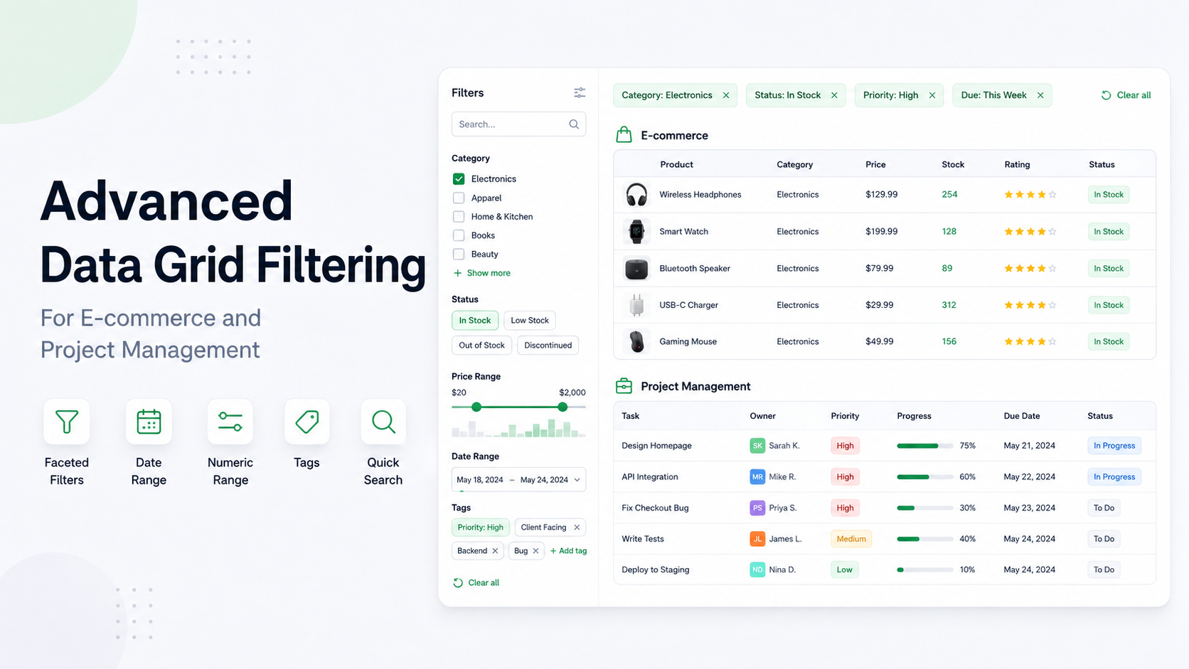
Data Grid
Choose the right data grid filters
Practical filtering patterns for orders, inventory, and project workflows.
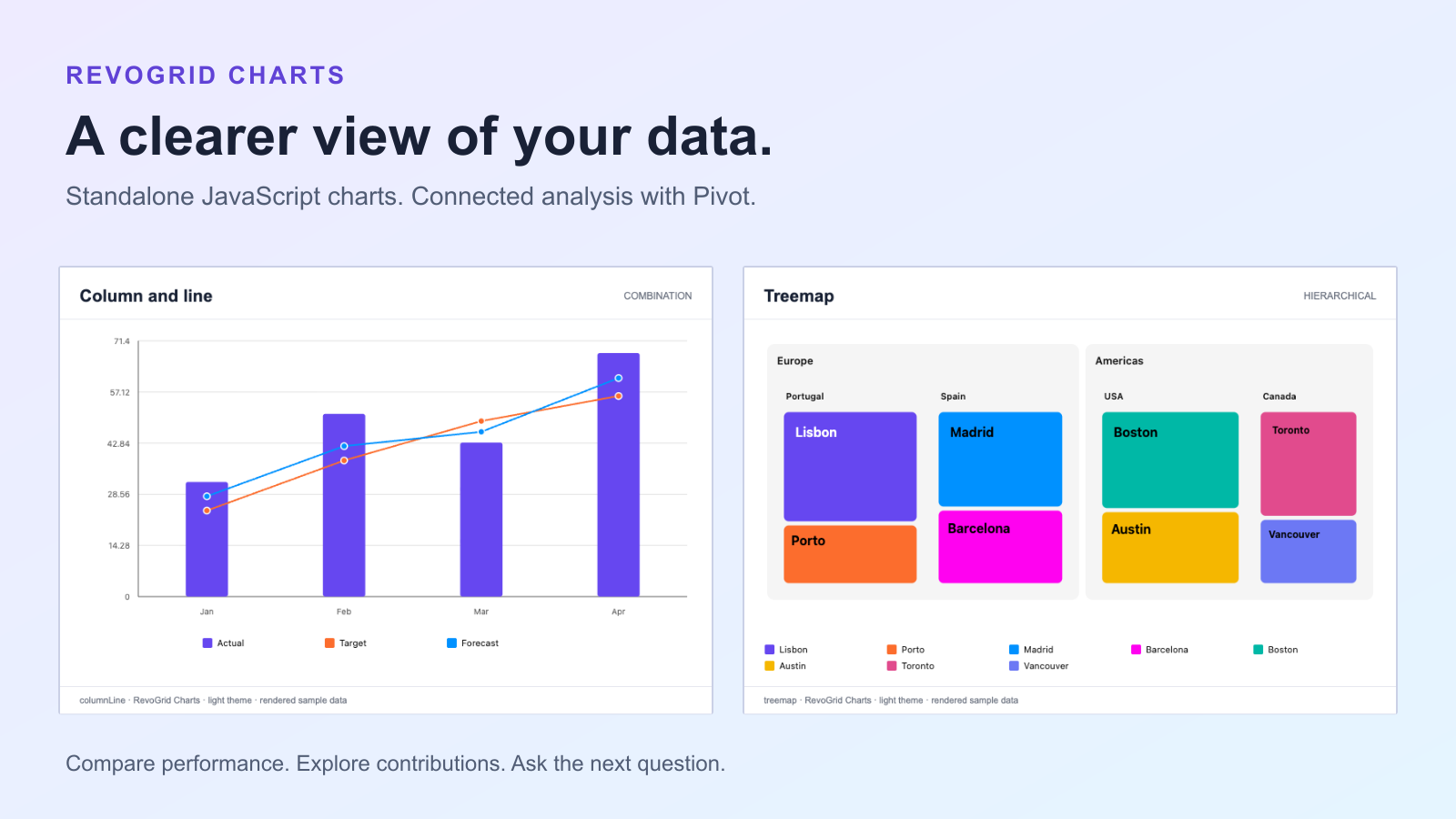
Your application already has the numbers. The next challenge is helping someone understand them: which category leads, whether a target is slipping, or where a larger total comes from. A useful dashboard makes those questions easy to ask and the answers easy to see.
RevoGrid Charts starts with standalone JavaScript charts in an ordinary HTML container. You can build a chart without adding a grid or Pivot table, and use it inside your preferred application framework. When users need to explore grouped data, the same chart engine also powers RevoGrid Pivot.
The local implementation includes 68 built-in chart types. Here are four practical places to start.
Standalone Charts preview
This introduction previews the standalone package using locally rendered examples. RevoGrid Charts is commercial software; confirm release availability and licensed package access before planning an installation.
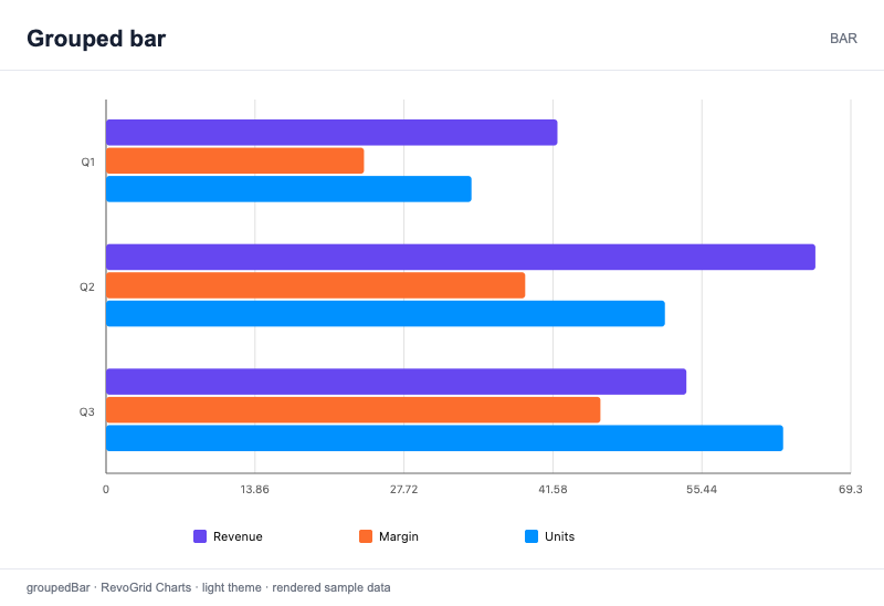
A grouped bar chart gives users a direct comparison across categories. Think sales by region, spending by department, or completed work by team. Placing series alongside each other helps a reader compare both the categories and the measures within each category.
Horizontal bars are particularly useful when names need room. Give the axis a meaningful unit, keep the category order intentional, and choose series that belong on the same scale. A dashboard card should make its comparison clear before someone opens a tooltip.
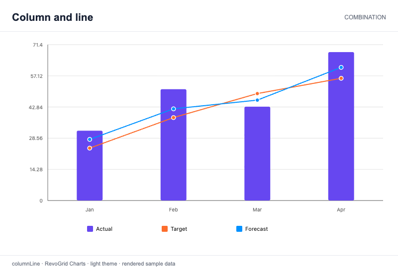
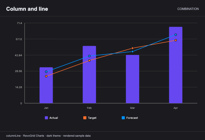
A total tells you where you are. A combination chart adds the context of where you expected to be. Columns can show actual results while lines show a target and forecast across the same months.
That puts the gap in view: did actuals catch up, fall behind, or change direction? In a revenue or operations dashboard, it gives users a reason to investigate a particular period. Keep units explicit and use a shared scale when the measures are directly comparable, as in the example below.
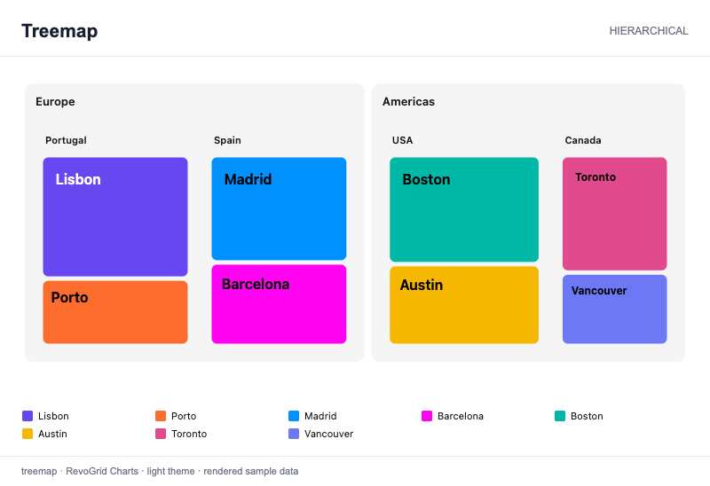
A treemap helps users see how parts fit inside a hierarchy. Regions contain countries; countries contain cities. Tile area represents contribution, while the surrounding groups preserve the structure that a flat ranking would lose.
Use this view to introduce a portfolio, product mix, or geographic breakdown. It helps someone notice a large contributor and understand its parent group. Keep a table or detail view nearby when the task requires exact values or close comparisons between similarly sized tiles.
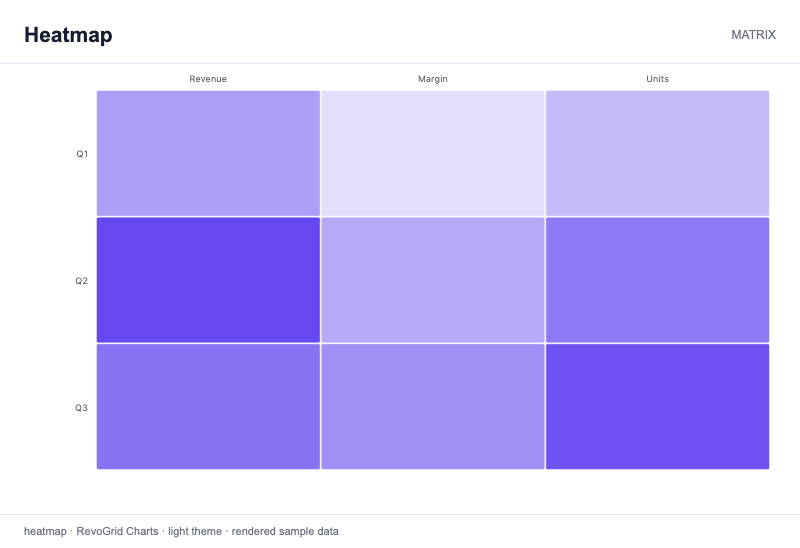
A heatmap turns a matrix into something readers can scan. Put one dimension on each axis and encode the measure through color: activity across periods and teams, demand across locations and products, or performance across segments.
It is useful when the question is about concentration or repeated patterns. A strong color scale and a clear legend help readers interpret the pattern; tooltips or a companion table can provide the exact figures. Color should support the question you want users to answer.
Start with a per-chart import when you need a specific visualization. RevoGrid Charts also supports composing a selected set of chart definitions, or importing the complete catalog for an application with a chart picker.
Map your rows to categories and numeric series, then update the chart as application data changes. Row mapping does not automatically group or aggregate records: prepare the values your visualization needs. The installation guide explains package access, imports and mounting your first chart.
Themes, presentation settings and export help the result fit into the rest of the product. Use supported chart options to set titles, labels and colors, and let users take a graphic into a report with SVG or PNG export. Navigation and interaction capabilities depend on the selected chart type.
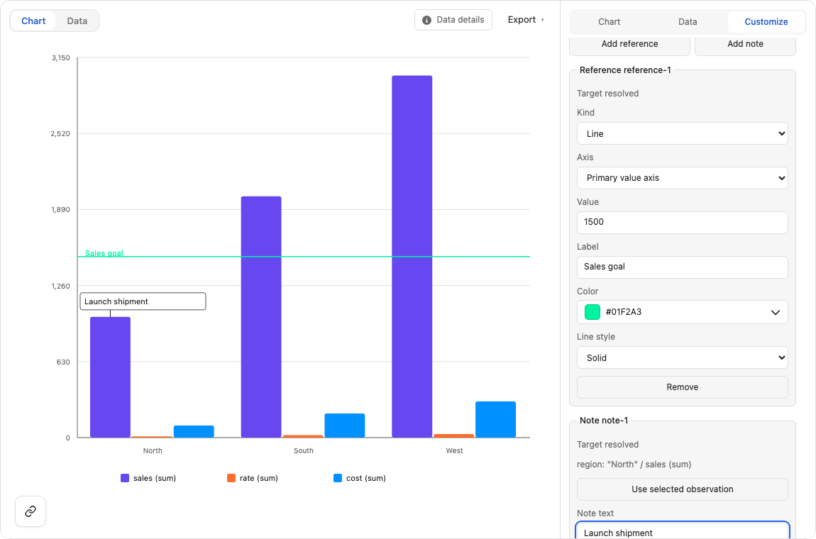
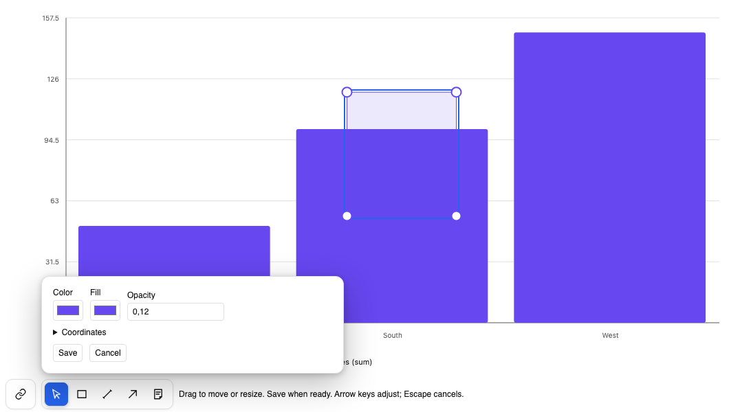
Help readers understand why a number changed and focus on the part of the chart that matters:
These tools work in standalone Charts, with support depending on the chart type. Saved annotations retain their chart coordinates across zoom. Committed annotations appear in graphic exports, while CSV stays focused on the data.
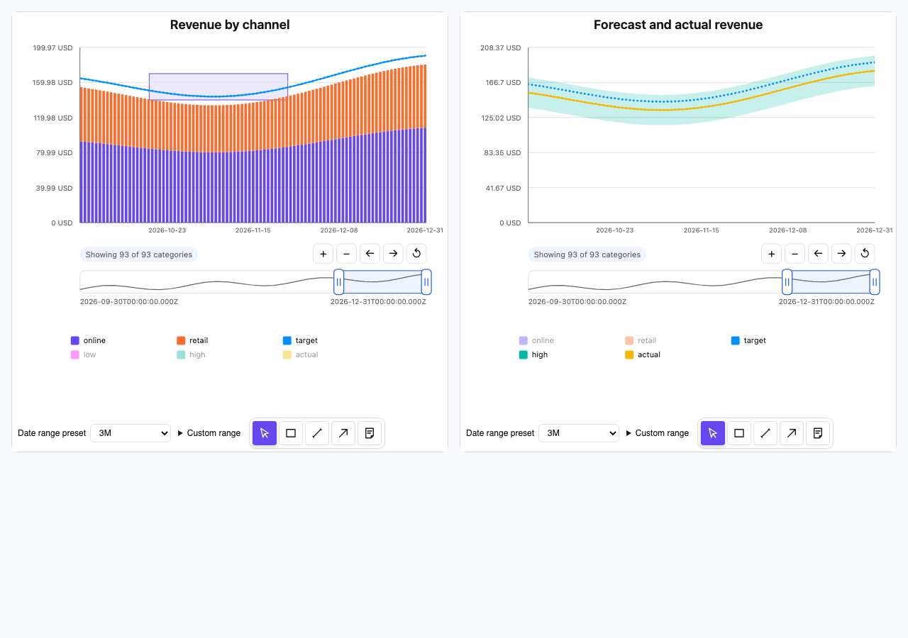
Standalone charts support local selection and events your application can handle. When readers need to change groupings, inspect a hierarchy, or keep charts aligned with a filtered analytical result, Pivot provides that additional context.
Through the Pivot adapter, compatible chart marks carry analytical identity into supported drill and filter synchronization. Your users can move from noticing a pattern to exploring the underlying report. This integration supplies the Pivot behavior; it is an additional step beyond rendering standalone rows.
Explore the Charts documentation to choose a visualization and review the setup. Then try the Pivot Charts dashboard to explore charts alongside an interactive Pivot table.
Practical filtering patterns for orders, inventory, and project workflows.
Bring editing, clipboard workflows, and large datasets into your web app.