
React composition
Recharts
MIT
Build familiar business charts with JSX and SVG.
Plan for: Your app owns queries, filters, and the detail table.
Read the evaluation →Interactive examples ↗Try synchronized charts and brushes.
Start with Recharts for a conventional React dashboard, ECharts or Plotly.js for specialized analysis, and a grid-connected stack when users need to change the report itself. The best choice depends on the workflow, the React integration, and the package tiers you need.
A useful BI dashboard connects the revenue trend, regional breakdown, and records behind the numbers. Selecting a region or period should keep those views consistent. That reporting workflow is the basis for this comparison of seven libraries.
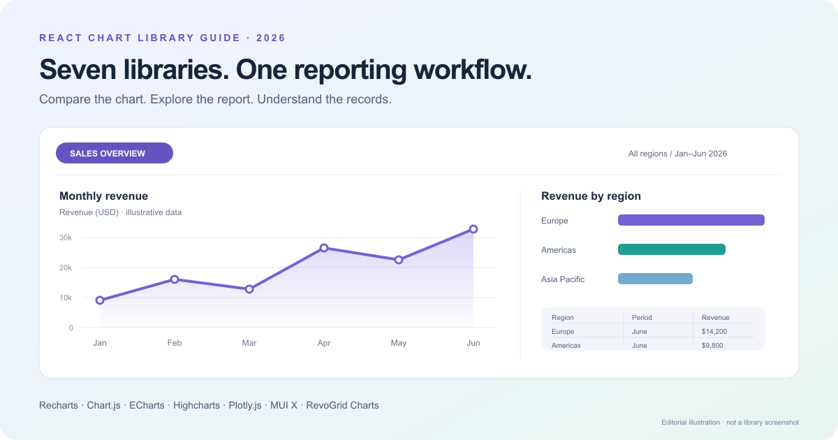
Choose a workflow to narrow the shortlist. Each card links to the detailed evaluation and the library's own interactive examples. These are starting recommendations; other libraries may also meet your requirements.
START WITH YOUR WORKFLOW
What are you building?
7 candidates to evaluate · editorial shortlist, not a capability limit
MIT
Build familiar business charts with JSX and SVG.
Plan for: Your app owns queries, filters, and the detail table.
Read the evaluation →Interactive examples ↗Try synchronized charts and brushes.
MIT
Supply datasets and options through react-chartjs-2.
Plan for: Plan accessible alternatives for Canvas content.
Read the evaluation →Interactive examples ↗Add a dataset, randomize values, and compare updates.
Apache-2.0
Explore varied chart types, datasets, and transforms.
Plan for: Choose a React lifecycle integration or adapter.
Read the evaluation →Interactive examples ↗Open a chart and edit its configuration.
Commercial for business use
Evaluate chart modules alongside its dashboard stack.
Plan for: Check the required products and license coverage.
Read the evaluation →Interactive examples ↗Inspect tooltips, legends, and navigation.
MIT engine
Investigate distributions and multidimensional data.
Plan for: Measure the required traces and renderer together.
Read the evaluation →Interactive examples ↗Explore statistical and scientific examples.
MIT Community; paid tiers
Keep charts aligned with an existing MUI application.
Plan for: Grid integration requires Premium packages.
Read the evaluation →Interactive examples ↗Explore live examples and their React source.
Commercial
Start with charts, then connect configurable reports.
Plan for: Use a DOM lifecycle integration; verify wrapper availability.
Read the evaluation →Interactive examples ↗Switch chart types in the live gallery.
| Library | Start here when… | React integration | Licensing boundary |
|---|---|---|---|
| Recharts | You want composable charts for a React product dashboard. | React components. | MIT. |
| Chart.js | You want Canvas-based charts and will own the reporting logic. | Commonly through react-chartjs-2. | Chart.js is MIT. |
| Apache ECharts | You need a broad visualization toolkit, data transforms, and renderer choice. | JavaScript engine integrated with React's lifecycle or an adapter. | Apache-2.0. |
| Highcharts | You need a commercial charting ecosystem with documented accessibility and dashboard tools. | Official Highcharts React integration. | Commercial licensing for business use; check the products covered. |
| Plotly.js | Statistical, scientific, or multidimensional analysis is central to the application. | react-plotly.js. | Plotly.js is MIT; commercial Plotly offerings are separate. |
| MUI X Charts | Your application uses Material UI, particularly with MUI's premium reporting components. | React components. | Community is MIT; Pro and Premium are commercial. |
| RevoGrid Charts | Charts need to work independently today and connect to Pivot reporting when required. | DOM-container lifecycle integration; see the wrapper availability note below. | Commercial chart engine; confirm the required Pivot entitlements separately. |
For a straightforward React dashboard, we would usually evaluate Recharts first. For a more specialized open-source visualization toolkit, we would shortlist Apache ECharts or Plotly.js. For users who need to change report dimensions and inspect the data behind charts, we would compare RevoGrid Charts with Pivot, MUI's Premium integration, and Highcharts' dashboard stack.
The sections below explain the trade-offs behind those recommendations.
Disclosure: RevoGrid publishes this article and develops RevoGrid Charts. The recommendations are organized around application requirements, including situations where another library is the better fit.
Documentation reviewed: October 16, 2026. This is a documentation-based architecture and feature comparison, using one reference dashboard. It is not a benchmark, a report of seven tested implementations, or a claim that every chart type supports every capability. Edition, module, and integration boundaries matter.
Use one sales-reporting workflow when evaluating the candidates.
The dashboard needs a monthly revenue trend, revenue by region, and a transaction table. A date-range control applies across the report. Selecting a region narrows the relevant results. Users can move from a summary to a more detailed breakdown and export either the chart or the appropriate data.
The important acceptance criterion is consistency: the chart, totals, table, and export must describe the same reporting scope.
| User action | What to verify |
|---|---|
| Change the date range | All relevant views update, including empty results and loading states. |
| Select a region | Decide whether selection highlights a mark, filters data, or changes the query. Test that exact behavior. |
| Drill into a result | Keep stable dimension identifiers and provide a clear way back to the previous scope. |
| Inspect source records | Show the transactions behind the selected result—not merely a table of aggregated chart points. |
| Export the report | Distinguish an image, chart-data CSV, and a full underlying-record export. |
Use this working RevoGrid Pivot Charts example to explore the reporting tasks discussed above. It uses 18 fictional order lines in USD; it demonstrates this integration rather than comparing the performance of seven engines.
The example keeps chart drill navigation local to the chart, while the period filter updates the linked report. Its CSV contains the chart’s current analytical scope, including its period filter and drill path. Underlying-record inspection requires a Pivot release that supports that feature; this installed example demonstrates drilling, period filtering, and CSV export.
These requirements prevent misleading feature comparisons. A synchronized tooltip is useful, but it is not cross-filtering. A click callback can initiate drill-down, but the application may still need to construct and authorize the query.
Explore interactive examples ↗ — Try synchronized charts or a brush, then identify which interactions your application must supply.
Recharts is built around composable React components and SVG. You describe a chart using components for the chart itself, its series, axes, and supporting elements.
Our recommended fit: dashboards with a known set of business charts and a team comfortable owning report state in React.
For the reference sales dashboard, you would prepare the monthly and regional datasets, render the appropriate charts, and connect their events to shared application state. This keeps report behavior explicit rather than hidden inside a separate reporting system.
Recharts also provides real coordination features. Compatible charts using the same syncId can synchronize tooltip and brush events. Its synchronization options matter when charts have different category sets: aligning by array index is not equivalent to aligning by category value.
The boundary is the reporting layer. Do not treat tooltip synchronization as a server query, pivot engine, or transaction explorer. You still need to define how a selection changes filters, totals, and the detail table.
Accessibility deserves an implementation review rather than an assumption based on SVG. Recharts documents an accessibilityLayer, enabled by default from version 3, that adds roles, labels, and keyboard controls.
Choose Recharts when JSX composition and control over the surrounding dashboard are your priorities. Evaluate another option first when your core requirement is an integrated, user-configurable reporting workspace rather than chart components.
Explore interactive examples ↗ — Add a dataset or randomize values to see configuration-driven updates.
Chart.js uses Canvas rendering. React applications commonly integrate it through react-chartjs-2, which supplies React components for Chart.js charts.
Our recommended fit: dashboards where the chart requirements are clear and the application already owns filtering, aggregation, and navigation.
Its configuration-first approach is different from composing a chart's structure through JSX. Your application supplies datasets and options; the chart engine handles drawing. That can be a useful separation for teams that prefer chart configurations to component trees.
For the sales dashboard, a shared region filter would recalculate or refetch the datasets passed to the revenue trend and regional breakdown. The table and export would read the same report state. The chart library does not need to own that entire workflow.
Chart.js documents selective imports and registration, along with performance techniques such as data preparation and line-data decimation. Those are tools to evaluate, not evidence that Chart.js is faster than every alternative in your application.
The important accessibility boundary is explicit in its documentation: Canvas contents are not inherently available to screen readers. You must supply accessible naming and alternative content; interactive reporting actions also need an accessible route.
Choose Chart.js when you prefer Canvas and a configuration-driven chart layer. Look elsewhere first when detailed keyboard exploration or a ready-made reporting workspace is the primary requirement and you do not want to assemble those layers yourself.
Explore interactive examples ↗ — Open a relevant chart and edit its configuration to match your data shape.
Apache ECharts provides a broad charting toolkit with interactive exploration features. Its supported renderers include Canvas and SVG.
Our recommended fit: applications where visualization variety and configurable analytical interactions are more important than a React-native component API.
ECharts has a useful distinction between data and presentation. Its dataset component lets multiple series reuse data. Data transforms support operations such as filtering and sorting, making it possible to derive chart inputs without independently rebuilding every series.
That is meaningful dashboard functionality. It would be inaccurate to describe ECharts as a renderer with no data-processing capabilities.
For our sales dashboard, ECharts can handle a shared dataset and interactive charts. We would still define the business meaning of a region selection, the authoritative aggregation rules, and how a chart action changes the transaction query. Local chart transforms should not become a second, conflicting definition of revenue.
React integration also requires deliberate lifecycle handling. Create the chart after its container exists, update the existing instance when appropriate, and dispose of it when the component unmounts. A framework adapter can manage that lifecycle, but its compatibility is another dependency to evaluate.
ECharts documents renderer trade-offs, ARIA descriptions and decals, and server-rendering options. Test the exact renderer and feature combination required by your application.
Choose ECharts when you need a configurable visualization toolkit under Apache-2.0. Choose a more React-centric alternative when your chart requirements are modest and your team strongly prefers composing the visualization through React components.
Explore interactive examples ↗ — Explore tooltips and legend controls, then test the dashboard components separately.
Highcharts React provides an official React integration, including components for chart elements and modules. Highcharts also documents dedicated accessibility functionality, including keyboard navigation and support for assistive technology.
Our recommended fit: business applications that want a commercial charting supplier and are willing to evaluate its modules and related products as a stack.
Highcharts has a genuine answer to coordinated dashboards. Highcharts Dashboards can connect charts and grid components, and its synchronization system supports behaviors such as linked highlighting, axis extremes, and series visibility.
However, “synchronized” should not be read as “arbitrary BI cross-filtering is automatic.” The documented predefined synchronization types have component-specific support and connector requirements. Implement and test your actual region-filter and drill-down rules.
For the reference dashboard, compare the complete implementation: chart modules, dashboard composition, the selected grid, and data connectors. Do not assume that installing Highcharts Core alone provides every dashboard component or that one product license covers the entire stack.
For dense plots, its Boost module provides an accelerated rendering path with feature trade-offs. Benchmark the same interactions you need in production rather than comparing only initial point rendering.
Highcharts' published licensing guidance requires a commercial license for company projects and business use.
Choose Highcharts when its commercial ecosystem, accessibility tooling, and dashboard components match your requirements. Start elsewhere when your requirement is an entirely permissive open-source charting stack.
Explore interactive examples ↗ — Start with a statistical or scientific chart that matches your analytical task.
Plotly.js covers statistical, scientific, financial, and multidimensional visualizations. Its React integration uses react-plotly.js, with figure configuration expressed through properties such as data and layout.
Our recommended fit: analytics products in which users need to examine distributions, relationships, or specialized data—not only a few summary KPIs.
For a simple monthly revenue chart, we would also evaluate Recharts or Chart.js. For a product that needs that revenue trend alongside statistical distributions or multidimensional exploration, Plotly's chart vocabulary becomes more relevant.
Plotly offers SVG and WebGL rendering paths, depending on the trace type. This provides options for dense visualizations, but WebGL is not an unlimited performance guarantee. Plotly documents browser context limits that can affect pages containing many WebGL figures.
The React wrapper's state-management guidance is particularly important for BI dashboards. Data refreshes and parent rerenders must not accidentally discard a user's exploration state. Make zoom, selection, and updates part of the acceptance test.
Image export also has renderer-specific behavior. Plotly notes that WebGL content can be rasterized within vector-format exports. Verify the output your customers actually need.
Plotly.js itself is MIT-licensed. Do not confuse adopting the JavaScript library with purchasing a separate commercial Plotly platform.
Choose Plotly.js when the analytical visualization requirements justify its figure model. Prefer a simpler shortlist when your application only needs a small set of conventional charts and none of those specialized capabilities.
Explore interactive examples ↗ — Explore the live charts and inspect their React source; check which package tier each feature needs.
MUI X Charts supplies React chart components with theming and composition capabilities. Its Community, Pro, and Premium packages have different feature and licensing boundaries.
Our recommended fit: applications already using Material UI, especially teams evaluating charts alongside MUI's Data Grid.
It is important to compare the current product rather than an older feature list. MUI documents Data Grid–Charts integration using Premium packages. It supports chart updates driven by grid state, including grouped and aggregated data, with examples covering pivoting, server-side data, and multiple charts.
For our reference dashboard, that puts MUI on the integrated-reporting shortlist—not just the standalone-chart shortlist.
The trade-off is the package boundary. Do not infer from the MIT license of Community Charts that the grid-connected analytical workflow is also included in Community. The documented integration uses @mui/x-data-grid-premium and @mui/x-charts-premium.
Renderer comparisons need the same care. The Charts overview describes SVG-rendered components, while Premium adds WebGL capabilities for supported workloads. Calling every MUI chart “SVG only” would miss that distinction.
MUI also documents keyboard navigation and screen-reader behavior. Check the individual chart type and whether the required activation behavior needs configuration.
Choose MUI X Charts when it fits the component ecosystem you already maintain. Compare other integrated options when the reporting experience must span frameworks or you do not otherwise benefit from adopting MUI's grid and chart stack.
RevoGrid Charts is a standalone JavaScript and TypeScript chart library. You can use it without a data grid and connect it to RevoGrid Pivot for a report-driven workflow.
Our recommended fit: applications in which users need to move between a visual summary, configurable report dimensions, and more detailed analytical views.
Hover or keyboard-focus chart marks to inspect Actual, Target, and Forecast values. This is the actual RevoGrid Charts renderer with illustrative data, mounted without a grid.
Explore more chart types in the interactive gallery, or return to the linked report example.
The standalone Charts package supplies visualization and local chart interactions. Its shared tools cover features such as navigation, annotations, selection, linking, and exports, with support depending on the chart type and renderer.
Pivot Charts adds the reporting connection: chart data derived from the Pivot result, drill-down, synchronization, and the optional chart-editing UI.
For the sales dashboard, this matters when a user wants to change the report itself—for example, moving from revenue by region to revenue by region and product—rather than merely selecting a point in a fixed chart.
A linked chart follows committed Pivot changes. That gives the report and chart a documented connection instead of requiring the application to infer analytical meaning from displayed grid cells.
The distinction is not that other libraries cannot build this experience. MUI and Highcharts also have documented integration paths. RevoGrid's proposition is its particular combination of standalone charting and Pivot-based reporting within the RevoGrid ecosystem.
The installation guide documents creating a chart in a DOM container after mounting and destroying it during component cleanup. This is a usable React integration without requiring a dedicated React wrapper.
Availability note: at the review date, the framework-components guide describes @revolist/react-charts but explicitly marks the wrapper packages as not yet published. Do not build an installation plan around a public wrapper release until that status changes.
The underlying chart engine is commercial and distributed through GitHub Packages. Configure licensed package access in development and CI; do not treat the MIT license of RevoGrid's community data grid as the license for Charts or Pivot.
Your application still owns authentication, authorization, trusted queries, and persistence of business records. A library's server-side contracts are not a hosted query service.
Export scope also needs a product decision. RevoGrid's standalone export documentation distinguishes the visible view from canonical chart data already loaded into the controller. An “all” chart-data export does not fetch every unloaded transaction from your backend.
Choose RevoGrid Charts with Pivot when the reporting workspace is the central requirement. Choose a simpler alternative when you only need a few React charts, have no Pivot workflow, and prefer a permissively licensed public npm package.
Regardless of the renderer, define a single report state: date range, selected dimensions, measures, filters, and drill path. Then derive the charts and table from that state.
For a small, already-authorized client-side dataset, a shared data function makes the principle concrete. This example assumes one currency, unique transaction records, and pre-bucketed YYYY-MM month values. It is an application helper—not an API supplied by any chart library.
export type Sale = Readonly<{
  id: string;
  month: string;
  region: string;
  revenueMinor: number;
}>;

export function buildRevenueView(
  rows: readonly Sale[],
  region: string | null = null,
) {
  const filteredRows = rows.filter(
    row => region === null || row.region === region,
  );
  const totals = new Map<string, number>();

  for (const row of filteredRows) {
    if (!/^\d{4}-(0[1-9]|1[0-2])$/.test(row.month)) {
      throw new Error(`Invalid month for transaction ${row.id}`);
    }
    if (!Number.isSafeInteger(row.revenueMinor)) {
      throw new Error(`Invalid amount for transaction ${row.id}`);
    }

    const total = (totals.get(row.month) ?? 0) + row.revenueMinor;
    if (!Number.isSafeInteger(total)) {
      throw new Error(`Revenue exceeds safe integer range: ${row.month}`);
    }
    totals.set(row.month, total);
  }

  const monthly = [...totals]
    .sort(([a], [b]) => a.localeCompare(b))
    .map(([month, revenueMinor]) => ({ month, revenueMinor }));

  return { filteredRows, monthly };
}
The trend chart consumes monthly; the detail table consumes filteredRows. Changing the region changes both through the same calculation. Each library needs only an adapter from this result into its preferred series format.
This helper intentionally does not implement the whole reference dashboard. Date-range filtering, region-breakdown semantics, drill paths, loading, and persistence still need application code. It also leaves absent months absent: decide explicitly whether they represent zero sales or unknown data before filling gaps.
For larger or permission-sensitive reports, use the same principle on the server: request aggregates and authorized detail records for the same scope. Do not calculate a full-report total from only the currently loaded table page.
When integrating an imperative chart engine, manage creation, updates, and cleanup deliberately. React's Effect documentation explains this external-system lifecycle, including the extra setup-and-cleanup cycle used by Strict Mode in development.
This article does not identify a fastest library. That conclusion requires a controlled benchmark of your actual dashboard.
Separate the number of source records from the number of visible chart marks. A report may aggregate many transactions into a few monthly points; another view may need to display individual observations. Those are different workloads.
A useful evaluation includes the production build, the chosen imports, representative devices, and equivalent chart behavior.
| Test | What to measure |
|---|---|
| Initial dashboard load | Chart-related JavaScript, initialization cost, and time until required interactions work. |
| Change a shared filter | End-to-end response time, including queries and aggregation—not just redraw time. |
| Resize the dashboard | Layout stability and responsiveness with all visible charts mounted. |
| Refresh while exploring | Whether zoom, selection, and drill state survive or reset intentionally. |
| Repeatedly open and close the view | Retained memory, event listeners, and resources after unmounting. |
Keep series count, labels, animation, viewport size, and interactions comparable. Do not give one candidate decimated data and another the full dataset, then attribute the difference entirely to the library.
Chart.js documents decimation, ECharts documents renderer selection, and Plotly documents WebGL trade-offs. Those are different ways to tune a workload, not interchangeable guarantees of dashboard performance. Chart.js · ECharts · Plotly
Test an actual analytical task with the keyboard and a screen reader: choose a region, understand the result, inspect the values, and return to the previous view.
A chart label alone does not make every interaction accessible. Chart.js explicitly requires accessible Canvas alternatives; Recharts, Highcharts, and MUI document different keyboard and assistive-technology mechanisms. Configure and test those mechanisms rather than assuming that selecting a library completes the work. Chart.js · Recharts · Highcharts · MUI
Use the same specificity for export. A chart image, its plotted values, and the underlying transactions are different deliverables. State the selected filters and reporting period in the output, and test the result rather than only checking that a file downloads.
D3 describes itself as a low-level visualization toolbox, rather than a conventional ready-made chart library. It is worth considering when the visualization itself is highly custom and building its structure and interactions is part of the product's value.
For the reference sales dashboard, we would evaluate the seven libraries above before choosing that lower-level route. For a bespoke analytical interface that existing chart components cannot express, D3 may be the more appropriate starting point.
Choose the library for the workflow you need to ship, not the longest feature list.
For a fixed React dashboard with application-owned reporting, start by comparing Recharts and Chart.js. For specialized analytical visualizations, shortlist Apache ECharts and Plotly.js. For a commercial charting ecosystem, evaluate Highcharts and the specific modules and dashboard products required.
For grid-connected BI, compare the complete integrations: MUI's Premium grid-and-chart stack and RevoGrid Charts with Pivot deserve direct evaluation, alongside Highcharts Dashboards where its coordination model fits.
Our strongest reason to recommend RevoGrid is not a universal claim about rendering speed. It is the fit when users need to change the report, explore the chart, and understand the data behind it within the same application.
Explore RevoGrid Charts to review the visualizations, then explore RevoGrid Pivot to evaluate the reporting workflow. For the wider architecture, see building enterprise dashboards and our JavaScript Pivot comparison.
FAQ
Product names and trademarks belong to their respective owners. Capability and licensing references reflect the documentation reviewed on October 16, 2026; confirm the exact packages and terms before adoption.
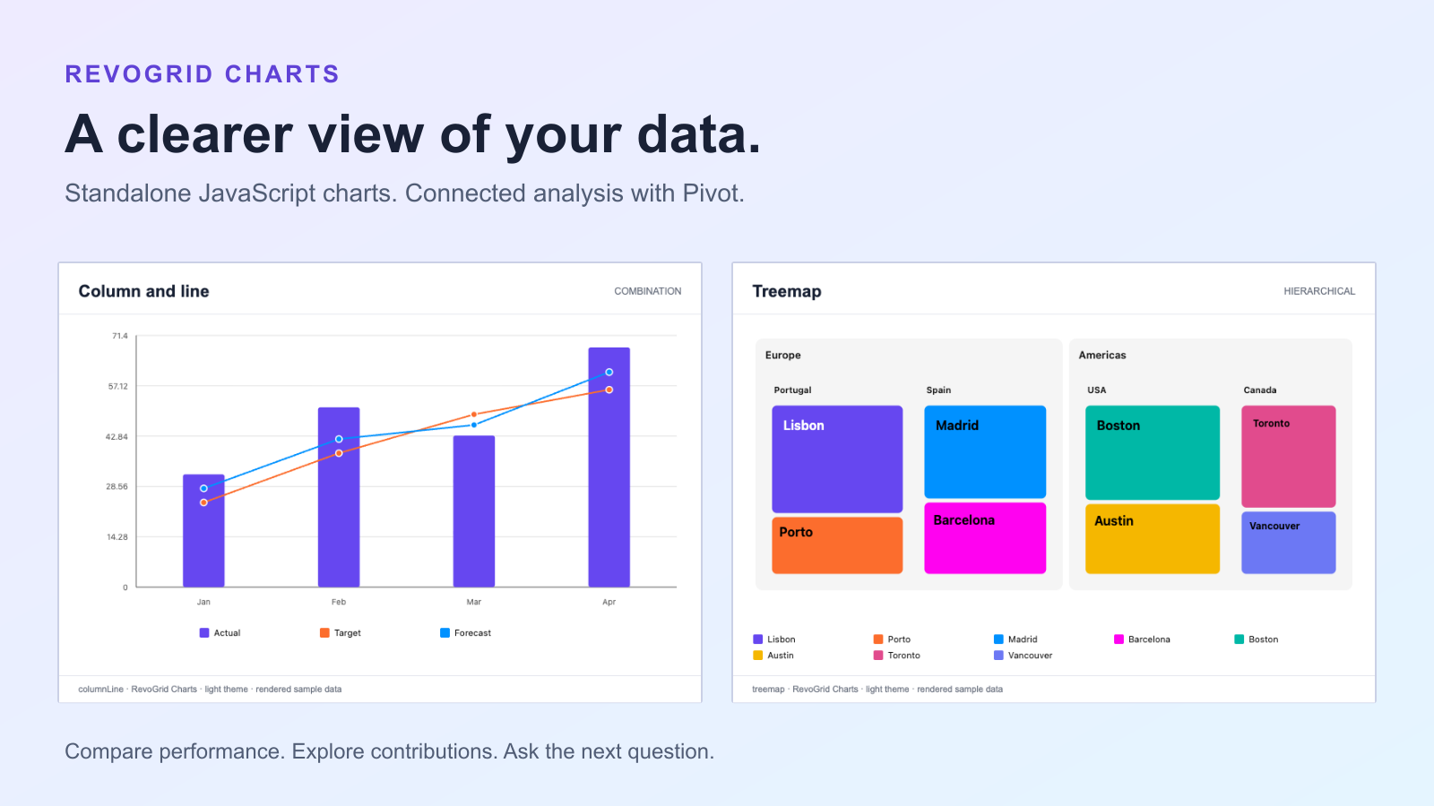
Explore RevoGrid Charts through four dashboard questions: compare categories, track targets, reveal hierarchies, and spot patterns. Start standalone, then connect to Pivot.
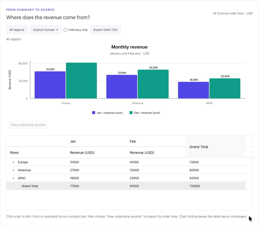
Build interactive JavaScript Pivot Charts with a real sales example. Drill from regions to products, inspect source orders, filter a linked report, and export chart data.