Use a waterfall to explain signed contributions between a starting and ending result. Use a Sankey to trace nonnegative amounts between sources and destinations. A profit change and a spending allocation are different questions.
Which Advanced Chart Should You Use for Business Analysis?
Revenue beats budget, but margin misses its target. Collections improve for most customers, yet a small group of large invoices still settles slowly. An executive scorecard looks strong overall while hiding one deteriorating capability.
These questions need more than a different chart shape. They need several series with clear roles, comparable scales, meaningful bins and useful context. This guide shows when to combine those elements—and when to simplify them.
Every figure is rendered by RevoGrid Charts using fictional business data. Each section has its own interactive example: change series, bins, reporting windows or chart layout beside the explanation. Static chart links remain available.
1. Why are sales above plan while profitability disappoints?
Use a combination chart with independent actual and budget stacks, plus margin lines. It connects composition, performance against plan and profitability in one monthly view.
Atlas Software's example has 12 months and six series. Actual Platform and Services revenue form one stack; budgeted Platform and Services revenue form another. The two stacks sit beside each other for every month. Actual margin and a 20% margin target use the percentage axis on the right.
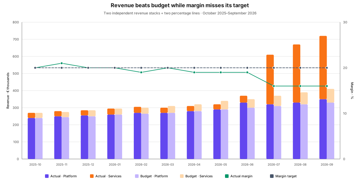
Read the chart in three passes. First compare each actual stack with its budget. Next examine which business line explains the difference. Finally check whether the margin line meets its target. A taller revenue stack does not imply a better margin.
Atlas's Q3 revenue reaches €2 million, split equally between Platform and Services. Company margin falls from 19% in Q2 to 16% in Q3 as the lower-margin Services business becomes a larger share. Both units actually improve their individual margins. The composition changes the company result.
The configuration that matters: stack only additive amounts together. Budget is a separate comparison, not another contribution to actual revenue. Keep percentage measures out of monetary stacks and label both axes. Calculate company margin from total profit divided by total revenue; averaging unit percentages would answer a different question.
Choose another view when: you need to reconcile a specific profit movement. A waterfall shows the signed contributions between starting and ending profit. If six series become difficult to follow, use small multiples with shared scales.
Try it: toggle a series in the legend, then narrow the combination to the last completed quarter. The full-period axis bounds remain fixed, preserving the visual comparison.
2. Which operating capabilities are falling behind?
Use grouped polar columns for a compact multi-profile scorecard; use radar when the overall profile is the main comparison. The circular layout earns its place when readers recognize a stable set of operating dimensions.
Our scorecard compares six metrics across three profiles: Q3 actual, Q2 actual and Q3 target. That produces 18 distinct observations. The polar view uses a 270-degree sweep, an inner hole, space between metric groups and smaller gaps between series. A fixed 0–100 value axis keeps all three profiles comparable.
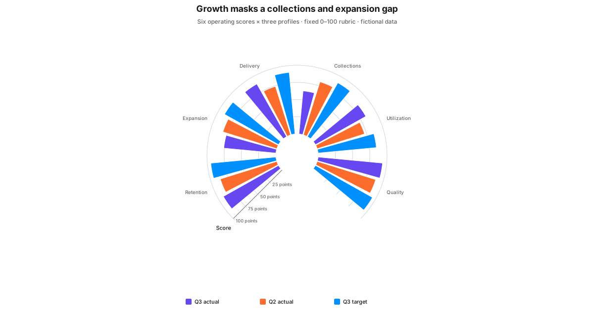
The important finding is the contrast. A company can improve delivery and utilization while collections deteriorates. One overall average would hide the trade-off. Grouping the three observations within each metric lets the reader distinguish a target gap from a change since last quarter.
The configuration that matters: these are illustrative assessment scores under a fixed 0–100 rubric. They are not raw revenue, margin and payment days placed on one arbitrary scale. Define the rubric and keep it stable between periods. Read radial length against the numeric axis; sector area is not an additional business measure. Keep actual, prior and target colors consistent across every metric.
Choose another view when: the metrics use unrelated raw units or readers need precise rankings. Use separate panels or a table. Radar can show the profile shape, but a larger polygon is not a valid total score and metric order changes its appearance.
Try it: choose the profiles to compare, then switch between grouped polar columns and radar. The data stays fixed; the visual emphasis changes.
3. Which customers ultimately absorb our operating costs?
Use a multi-stage Sankey when the relationships matter as much as the amounts. A treemap explains what makes up spending; Sankey explains how allocations connect several dimensions.
Atlas allocates €1.68 million through three stages: cost pools → product units → customer segments. People, Technology and Commercial costs each split between Platform and Services. Both product units then allocate costs to Enterprise and SMB customers. This is a many-to-many assignment rather than a simple department hierarchy.
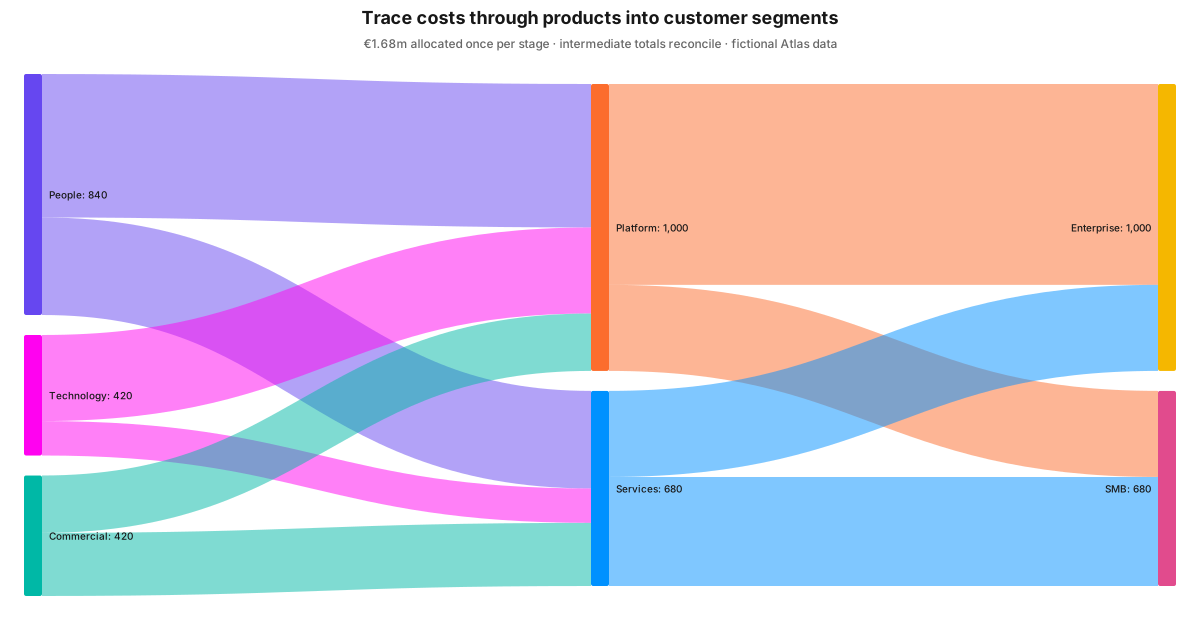
Follow a pool through the middle stage to see the allocation structure. Enterprise receives €700,000 through Platform and €300,000 through Services. The product totals and segment totals answer different management questions while reconciling to the same company cost base.
The configuration that matters: band width represents nonnegative money. Intermediate inflows and outflows reconcile in this example. Do not add amounts across successive stages: the same euros appear more than once as they move through the model. Stable node identities, deliberate ordering, value labels and highlighting help readers follow crossings without confusing similarly named items.
Choose another view when: the connections add little information. A treemap is more compact for department → cost-center composition; sorted bars make close amounts easier to compare. Neither an allocation model nor its chart proves that the recipient caused the cost.
Try it: reveal individual link values or highlight a node and its immediate connections. The extra labels are useful during inspection, but need not dominate the initial view.
4. Is the payment problem frequent, expensive, or both?
Use a histogram collection with shared bins and explicit metric bindings. Box plots summarize median and spread; histograms reveal where observations cluster, whether several peaks exist, and how much sits in a long tail.
Our worked example contains 72 settled Enterprise invoices and 72 settled SMB invoices. Each cohort has a payment-duration series and a corresponding invoice-value series. Both use the same 15-day boundaries from zero to 120 days, so the interval represented by a column stays consistent.

Now change the vertical metric from invoice count to summed invoice value without changing the duration bins. Those longer Enterprise payments account for €143,000 of settled invoice value; the longer SMB payments account for €3,200. Frequency and financial magnitude lead to different follow-up priorities.
The configuration that matters: shared explicit boundaries prevent each cohort from choosing a different automatic partition. The sample field determines bin membership; the paired value field determines what gets summed. Keep units visible. Opacity allows overlaps to remain visible, and hiding one cohort helps inspect the other. These views show totals, not percentages normalized for cohort size or total value.
Unequal bin widths need extra care: a wide interval naturally collects more observations. Use a clearly explained density encoding when area should represent frequency, or retain equal widths for a straightforward comparison. A mean-per-bin view answers yet another question—typical invoice size within a duration interval.
Choose another view when: you need an individual invoice's date, or the sample is too small for meaningful bins. Use points, a timeline or records. Pareto is useful before this step when you need to identify which accounts dominate revenue or outstanding balances. Never derive a distribution from monthly averages; unpaid invoice ages are a separate population.
Try it: switch the same two distributions from counts to invoice value, then compare 10-, 15- and 30-day bins. A bin summarizes observations; it is not itself an invented invoice record.
5. Does the forecast deserve the confidence the report gives it?
Use observed time series with a separate forecast and prediction band. A target line states a commitment; a prediction band expresses uncertainty under a model. They should remain distinguishable even when shown together in a report.
Atlas's 12 completed monthly observations include a sharp rise near the end. Its forecast extrapolates a linear trend with 95% Student-t prediction intervals. The future band asks what continuation of that model could imply, rather than explaining the shift in the business.
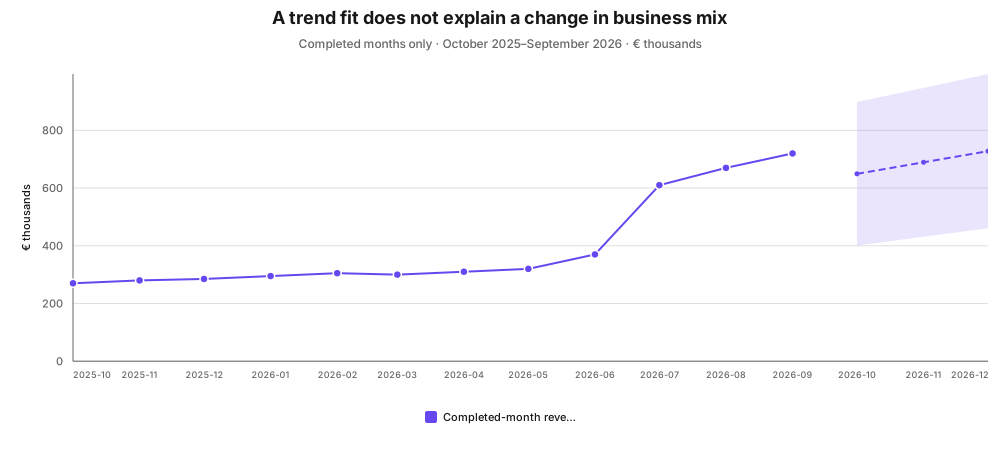
The configuration that matters: supply completed periods, preserve missing observations and choose a meaningful forecast cadence. RevoGrid's illustrated method is linear ordinary least squares; it does not model seasonality. A prediction interval concerns a future observation, while a regression confidence interval concerns the fitted mean. Neither guarantees an outcome when the model assumptions fail.
Choose another view when: the decision is simply whether a KPI met its agreed target. Bullet charts show actual, target and performance bands more directly. For a seasonal or structurally changing business, use a suitable external forecasting model and state its assumptions.
Try it: extend the horizon from three to six months. Keep the observation policy fixed so a change in training data does not get confused with a change in horizon.
6. Does a market-price move have supporting volume?
Use a financial price-and-volume chart with annotations and time navigation. This fits market-data reviews where a closing-price line alone hides the session's range and activity.
Our example contains 120 fictional weekday sessions and five bound measures: open, high, low, close and volume. Candles encode price movement and range; a separate lower pane shows volume. Authored reference levels, a review band and parallel channel lines retain the analyst's context while the time window changes.
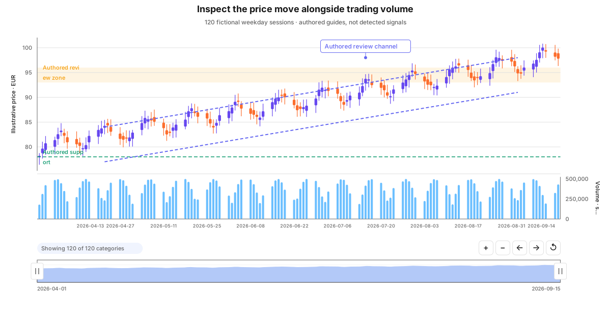
The configuration that matters: price and volume need independent scales. Allocate enough pane height to read both, retain a common time axis, and use crosshair inspection and date presets to investigate a period. A channel is an authored annotation here, not a fitted statistical model. The example excludes weekends but does not claim an exchange holiday calendar.
Choose another view when: the business question concerns monthly revenue, expenses or operating margin. Candlesticks require genuine open/high/low/close observations. Their visual sophistication does not make them appropriate for ordinary accounting totals.
Try it: switch candles to a closing-price line, then change the date window. This shows how much range information the simpler representation leaves out. Moving-average or forecast overlays are not added to this financial view.
Choose the structure that answers the question
| Decision | Useful complex presentation | Keep explicit |
|---|---|---|
| Explain plan versus actual and mix | Independent stacks + margin/target lines | Stack membership and money/percentage axes |
| Compare operating profiles | Three-series polar columns or radar | Fixed scoring rubric and numeric domain |
| Trace allocated costs | Multi-stage, many-to-many Sankey | Reconciliation and repeated stages |
| Compare payment tails | Shared histogram bins + paired value fields | Count, sum, mean or density |
| Assess the outlook | Observations + forecast + prediction interval | Training periods and model assumptions |
| Inspect a market move | OHLC + volume + annotations | Price/volume scales and authored guides |
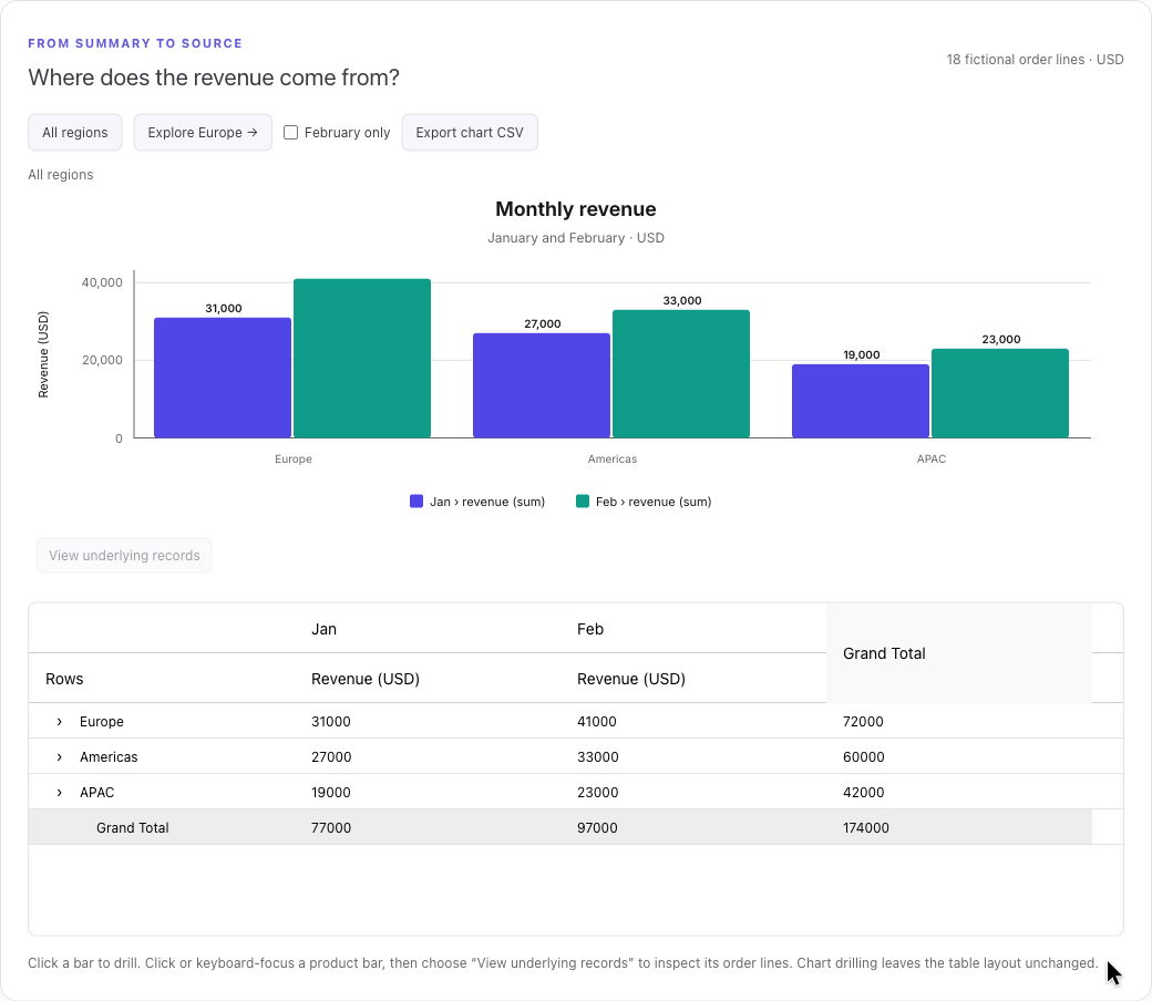
For implementation, see the Charts guides and analysis tools. Interactive Pivot Charts covers the path from summaries to supporting records. Charts and Pivot are commercial products; confirm the options available in your installed licensed or trial release.
FAQ