
Customer Analytics with a JavaScript Pivot Table
Customer teams need to move from a broad signal—Gold members spend more or one city rates the service lower—to the segment behind it. RevoGrid Pivot turns customer records into an embedded workspace where product, growth, loyalty, and customer-success teams can reshape governed data without waiting for a new report.
RevoGrid Pivot is included in RevoGrid Pro Advanced. It combines the Pivot model with RevoGrid's virtualized grid surface, configurable fields, filters, totals, custom cell presentation, and linked Pivot charts.
Explore RevoGrid Pivot · Open the live demo · Get Pro Trial
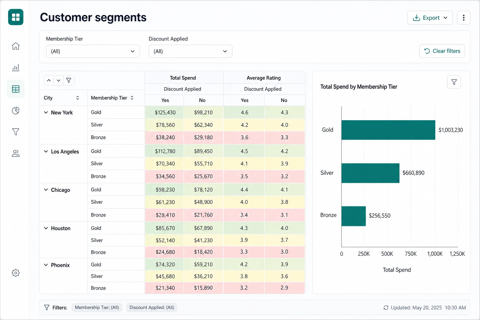
The business problem: segments must remain explainable
Customer data usually arrives as event or transaction rows: customer ID, city, membership tier, order value, rating, campaign exposure, and discount usage. A KPI can show total spend or average rating, but it hides the composition. A chart can reveal a difference between tiers without showing whether geography, discounts, cohort size, or outliers caused it.
A useful surface preserves that context. Analysts compare like-for-like segments, expand from city to tier, switch between total and average measures, and keep filters visible. Product teams can embed the experience where authentication, entitlements, saved views, and follow-up actions already live.
A recommended Pivot model
Start with a specific question: “How do membership tiers perform across cities, and how does discount usage relate to spend and satisfaction?” This layout matches the customer-segmentation view while remaining configurable.
| Area | Recommended fields | Why it belongs there |
|---|---|---|
| Rows | City → Membership Tier | Creates an expandable geographic-to-loyalty hierarchy and makes each segment auditable. |
| Columns | Discount Applied | Places discounted and non-discounted outcomes side by side instead of mixing them in one average. |
| Values | Total Spend (sum), Total Spend (average), Average Rating (average), Customer ID (count) | Separates segment scale, per-record behavior, satisfaction, and sample size. Use a stable customer-level grain when the count is meant to represent customers. |
| Filters | Membership Tier, date or cohort, channel, product, consent/eligibility scope | Lets teams isolate a decision-relevant population while retaining the same report structure. |
This is a starting view, not a universal schema. If rows represent orders, a count may count orders rather than unique customers. Supply customer-grain records or calculate a governed distinct-customer metric before labeling it “customers.”
A realistic segmentation workflow
Begin with all eligible customers and compare total spend by membership tier. The linked chart gives a fast visual read; the Pivot table preserves the values and hierarchy behind each bar. Expand a city, then compare discounted and non-discounted columns across total spend, average spend, rating, and population count.
If Gold members show the highest total spend, filter to a signup cohort and check whether the pattern persists across cities. Compare average spend so a larger tier does not win only because it has more records. Read rating and count beside revenue: a high-spend, low-rating segment may need retention work, while a small high-rating cohort remains unproven.
Users can move fields among Rows, Columns, Values, and Filters as the question changes. Save approved layouts so recurring reviews begin from shared definitions.
Heatmaps should accelerate reading, not define truth
Application-defined cell properties and column types make value-aware formatting possible in Pivot output. A customer view can apply green, amber, and red treatments to spend or rating ranges. This is conditional formatting over numeric values—not a statistical heatmap engine or recommendation system.
Choose thresholds from documented rules, display the number, and keep the palette accessible in light and dark themes. Spend and ratings need separate scales, and color should never be the only carrier of meaning.
Use linked charts for comparison, then return to the table
Linked Pivot charts project the active result into a chart-friendly view. Use them to rank tiers or compare spend across a filtered cohort without duplicating analytical logic in a disconnected dashboard. The Pivot demo supports creating charts from the active result through its linked-chart workflow.
Keep each chart to one question, a readable category set, and a clear unit. Use the table for exact values, totals, hierarchy, and auditability. Validate chart refresh behavior when filters or configuration change.
Guardrails: privacy, grain, and metric definitions
Customer analytics can expose sensitive behavior even without names. Enforce authorization and row-level access before records reach Pivot. Minimize fields, suppress or combine small cohorts, and exclude direct identifiers from configurable dimensions unless required. Saved layouts should store configuration, not unauthorized data snapshots.
Define each metric close to the product experience:
- Total spend: gross, net, refunded, and tax treatment; reporting currency; and time zone.
- Average spend: per order, per customer, or per active customer.
- Average rating: included channels, missing-value handling, and minimum response count.
- Discount applied: coupon use, any price reduction, or campaign attribution.
- Membership tier: current tier or the tier at transaction time.
A correct average can still mislead when its grain or cohort changes.
Choose the client/server boundary deliberately
Use client-side Pivot when permitted data is already in the browser, memory is acceptable, and field changes meet latency targets on representative devices. Virtual rendering limits DOM work, but not source memory or aggregation cost.
Use a server-side model when records must remain behind governance controls, cardinality or calculations exceed browser budgets, or metrics must stay authoritative across products. Rows, Columns, Values, Filters, totals, and drill concepts remain consistent, so computation can move behind an application-owned service without replacing the product surface.
Implementation and evaluation checklist
- Confirm record grain, join rules, missing values, currency, and time-zone policy.
- Define every displayed measure, especially customer count and average spend.
- Enforce entitlements before data delivery and set small-cohort suppression rules.
- Test the default hierarchy, field changes, filters, totals, drill state, and saved layouts.
- Validate heatmap thresholds, contrast, number formats, and non-color cues.
- Check linked-chart categories, units, empty states, and refresh behavior.
- Measure production builds with realistic row counts, dimension cardinality, and user hardware.
- Test browser memory, cold load, repeated configuration changes, and export requirements.
- Decide when the experience should switch to an application-owned server model.
- Run a trial with representative—not synthetic best-case—customer data.
Build the customer analytics experience
Use the Pivot product overview to review the complete capability set, try the workflow in the live Pivot demo, or get the RevoGrid Pro Advanced trial to evaluate your dataset, privacy boundary, metrics, and performance targets.
Explore other Pivot use cases
Continue with Revenue Analytics or Financial Reporting.