
Data Grid
Build an Excel-like spreadsheet in React
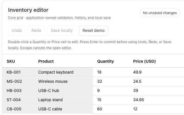
Paste from Excel, validate inventory, and add undo and redo to a working editor.
TanStack Table is a headless table library; AG Grid and RevoGrid are rendered data grids. Choose TanStack Table when you want to own the markup and interaction design. Choose AG Grid or RevoGrid when you want built-in cell editing, filter controls, keyboard navigation, and virtualization as a starting point for an editable React table.
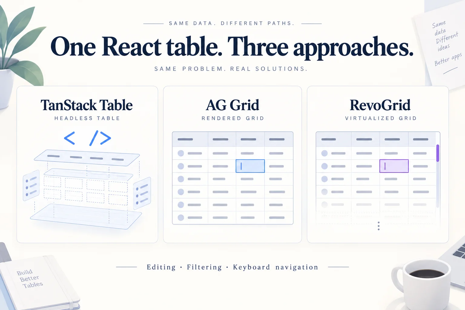
TanStack Table, AG Grid, and RevoGrid can all be used to build data-heavy React interfaces, but they approach the problem differently.
TanStack Table is headless. It provides table state and data-processing primitives while your application owns the markup, styling, editors, and much of the interaction layer.
AG Grid is a full data-grid component. Editing, filtering, grid navigation, and many other interactions are implemented by the grid itself.
RevoGrid is also a rendered data grid, with virtualized rows and columns, editing, filtering, and spreadsheet-style keyboard interaction in its open-source core.
This comparison follows the same customer-table requirements through all three libraries, focusing on the code and behavior each application must own.
The application needs to:
The snippets are focused implementation excerpts, not three complete runnable applications. Shared React state, layout, validation, and save feedback still need to be connected. TanStack examples below use the v8 API; AG Grid setup follows its v36 React documentation; RevoGrid examples use the Core v4 API. Use the linked guides for complete setup.
Disclosure: RevoGrid publishes this comparison. The goal is not to pretend every project should use RevoGrid. TanStack Table and AG Grid are good choices for different architectures, and we will call those situations out directly.
For ordinary text editing, client-side filtering, and application-owned saving:
| Requirement | TanStack Table | AG Grid | RevoGrid |
|---|---|---|---|
| Render finished grid | Application code | Built in | Built in |
| Basic cell editing | Application editor | Built in | Built in |
| Filtering logic | Built in | Built in | Built in |
| Basic filter UI | Application code | Built in | Built in |
| Grid keyboard navigation | Application/composed behavior | Built in | Built in |
| Virtualized rendering | Add a virtualizer | Built in | Built in |
| Save to API | Application code | Application code | Application code |
| Basic example requires paid edition | No | No | No |
TanStack Table deliberately separates table state from rendering. Its v8 virtualization guide makes the distinction explicit: virtualization is not supplied by TanStack Table itself; applications can pair it with TanStack Virtual or another virtualization implementation.
AG Grid and RevoGrid own the grid viewport and much of the interaction model.
Imagine a small customer-management screen:
| Name | Company | Role | Status |
|---|---|---|---|
| Alice Morgan | Northstar | Engineer | Active |
| Daniel Lee | Acme | Designer | Active |
| Sofia Garcia | Orbit | Manager | Trial |
| Marcus Brown | Beacon | Engineer | Inactive |
Users need to edit any value, filter the data, move through editable cells using the keyboard, and eventually click:
Save changes
The persistence layer is deliberately application-owned in all three examples.
A grid should help you edit data. It should not decide how your API stores it.
Our shared row model is:
type Customer = {
  id: number
  name: string
  company: string
  role: string
  status: string
}

const initialData: Customer[] = [
  {
    id: 1,
    name: 'Alice Morgan',
    company: 'Northstar',
    role: 'Engineer',
    status: 'Active',
  },
  {
    id: 2,
    name: 'Daniel Lee',
    company: 'Acme',
    role: 'Designer',
    status: 'Active',
  },
  {
    id: 3,
    name: 'Sofia Garcia',
    company: 'Orbit',
    role: 'Manager',
    status: 'Trial',
  },
  {
    id: 4,
    name: 'Marcus Brown',
    company: 'Beacon',
    role: 'Engineer',
    status: 'Inactive',
  },
]
All three implementations use the same application-owned save function:
async function saveCustomers(customers: Customer[]) {
  const response = await fetch('/api/customers', {
    method: 'PUT',
    headers: {
      'Content-Type': 'application/json',
    },
    body: JSON.stringify(customers),
  })

  if (!response.ok) {
    throw new Error(`Saving customers failed: ${response.status}`)
  }
}
The /api/customers path is an example backend endpoint you implement. Each application should display saving, success, and error states around this request.
Now the implementations diverge.
Install TanStack Table:
npm install @tanstack/react-table@8The TanStack Table v8 editable-data example demonstrates its headless table approach. It provides table state and APIs, but deliberately does not render a finished table interface for you.
That distinction becomes important as soon as we add editing.
With TanStack Table, your application renders the <table>, <thead>, <tbody>, rows, cells, and controls.
Import the v8 renderer separately, then use the table instance from useReactTable:
import { flexRender } from '@tanstack/react-table'

<table>
  <thead>
    {table.getHeaderGroups().map(headerGroup => (
      <tr key={headerGroup.id}>
        {headerGroup.headers.map(header => (
          <th key={header.id} colSpan={header.colSpan} scope="col">
            {header.isPlaceholder ? null : flexRender(
              header.column.columnDef.header,
              header.getContext(),
            )}
          </th>
        ))}
      </tr>
    ))}
  </thead>

  <tbody>
    {table.getRowModel().rows.map(row => (
      <tr key={row.id}>
        {row.getVisibleCells().map(cell => (
          <td key={cell.id}>
            {flexRender(
              cell.column.columnDef.cell,
              cell.getContext(),
            )}
          </td>
        ))}
      </tr>
    ))}
  </tbody>
</table>
This is not a weakness. It is the central design decision of TanStack Table.
You own the DOM.
If your application already has a design system with its own table components, accessibility conventions, responsive behavior, menus, inputs, and styling rules, that level of control can be extremely useful.
But it also means an editable table requires more application code.
The editable-data example uses table metadata as one way to expose an updateData function to cell components.
A simplified editable cell could look like this:
import * as React from 'react'

function EditableCell({
  getValue,
  row,
  column,
  table,
}: any) {
  const initialValue = getValue()
  const [value, setValue] = React.useState(initialValue)

  React.useEffect(() => {
    setValue(initialValue)
  }, [initialValue])

  const commit = () => {
    table.options.meta?.updateData(
      row.index,
      column.id,
      value,
    )
  }

  return (
    <input
      aria-label={`Edit ${column.id} for row ${row.index + 1}`}
      value={value ?? ''}
      onChange={event => setValue(event.target.value)}
      onBlur={commit}
      onKeyDown={event => {
        if (event.key === 'Enter') {
          event.currentTarget.blur()
        }
      }}
    />
  )
}
Connect that editor to the columns, filtering row model, and React state. Inside your component, after const [data, setData] = React.useState(initialData):
const table = useReactTable({
  data,
  columns: [
    { accessorKey: 'name', header: 'Name' },
    { accessorKey: 'company', header: 'Company' },
    { accessorKey: 'role', header: 'Role' },
    { accessorKey: 'status', header: 'Status' },
  ],
  defaultColumn: { cell: EditableCell },
  getCoreRowModel: getCoreRowModel(),
  getFilteredRowModel: getFilteredRowModel(),
  meta: {
    updateData: (rowIndex, columnId, value) => {
      setData(old =>
        old.map((row, index) =>
          index === rowIndex ? { ...row, [columnId]: value } : row,
        ),
      )
    },
  },
})
Import useReactTable, getCoreRowModel, and getFilteredRowModel from @tanstack/react-table. In TypeScript, declare the updateData extension to TableMeta as shown in the official editable-data example. Keep column definitions stable in a production component.
The important point is architectural:
TanStack Table helps organize the table model. Your application implements the editing UI.
Filtering logic is built into TanStack Table, including column and global filtering. But the library does not automatically render the filtering interface for you.
For this customer table, render a search input connected to the table state. The getFilteredRowModel() option above enables client-side filtering.
That might look like:
<input
  aria-label="Search customers"
  value={table.getState().globalFilter ?? ''}
  onChange={event =>
    table.setGlobalFilter(event.target.value)
  }
  placeholder="Search customers..."
/>
For column-specific controls instead, use the filter inputs in the linked editable-data example.
This gives you excellent control over the final UX.
It also means that filter controls are part of your application UI, not something TanStack Table simply places on the screen.
Native inputs already give us Tab and Shift+Tab navigation. We can implement Enter-to-commit ourselves.
If we want true grid-style keyboard navigation—Arrow keys moving between cells, selection ranges, focus management, and spreadsheet shortcuts—we need to build more interaction logic.
In this v8 example, spreadsheet-style cell focus and range-selection interactions require application code or additional libraries. Row-selection state does not by itself implement keyboard navigation between cells.
Again, this is consistent with its philosophy:
TanStack provides primitives. You compose the experience.
For this example:
TanStack provides:
Our application provides:
No commercial edition is required. TanStack Table is MIT-licensed.
Install AG Grid for React:
npm install ag-grid-react@36AG Grid takes a very different approach.
Instead of giving us table primitives and asking us to build the UI, it renders the grid.
The AG Grid React quick start covers imports, Community modules, and container sizing. Enterprise functionality is added separately when required.
Our editable columns become configuration:
const columnDefs = [
  {
    field: 'name',
    headerName: 'Name',
    editable: true,
    filter: true,
  },
  {
    field: 'company',
    headerName: 'Company',
    editable: true,
    filter: true,
  },
  {
    field: 'role',
    headerName: 'Role',
    editable: true,
    filter: true,
  },
  {
    field: 'status',
    headerName: 'Status',
    editable: true,
    filter: true,
  },
]
Provide the Community modules and a container with a defined height:
import { AllCommunityModule } from 'ag-grid-community'
import { AgGridProvider, AgGridReact } from 'ag-grid-react'

<AgGridProvider modules={[AllCommunityModule]}>
  <div style={{ height: 400 }}>
    <AgGridReact rowData={data} columnDefs={columnDefs} />
  </div>
</AgGridProvider>
Cell editing is a first-class AG Grid behavior: setting editable: true on a column enables it, and the grid provides editors based on the data type unless you configure another editor.
That is already a major difference from our TanStack implementation.
There is no custom <input> renderer required for ordinary cell editing.
AG Grid provides column filtering as part of the grid UI.
For the simple version:
{
  field: 'company',
  filter: true,
}
For these text fields, use the Community Text Filter. Explicitly set filter: 'agTextColumnFilter' if the application also loads Enterprise modules and you want to retain that filter type.
An optional Quick Filter searches across columns; search is application-owned text input state. The onCellValueChanged callback is defined below. Place this grid inside the provider and sized container above:
<AgGridReact
  rowData={data}
  columnDefs={columnDefs}
  onCellValueChanged={onCellValueChanged}
  quickFilterText={search}
/>
Unlike TanStack, we are not building the basic filter mechanics or cell editing UI ourselves.
We configure them.
Persistence still belongs to the application.
For example:
const onCellValueChanged = event => {
  setData(current =>
    current.map(row =>
      row.id === event.data.id
        ? { ...event.data }
        : row,
    ),
  )
}
Then:
<button onClick={() => saveCustomers(data)}>
  Save changes
</button>
AG Grid emits editing events including cellValueChanged, allowing application code to react when values are committed.
Keyboard navigation is part of the grid interaction model.
When you introduce custom editors, AG Grid also exposes hooks for deciding which keyboard events belong to the editor and which should continue to drive grid navigation.
That means considerably less interaction code for a spreadsheet-like editable interface than the basic TanStack implementation.
For these requirements—basic editing, ordinary filtering, and saving—we do not need AG Grid Enterprise.
That changes when requirements expand.
Examples of current Enterprise functionality include:
So the licensing question should be based on the actual capabilities your application needs—not simply whether you need an editable React table.
AG Grid provides:
Our application provides:
For this example, AG Grid Community is enough.
Install RevoGrid's React wrapper:
npm install @revolist/react-datagrid@4Follow the RevoGrid React installation guide. Its basic component takes data and columns:
import { RevoGrid } from '@revolist/react-datagrid'

<RevoGrid
  source={data}
  columns={columns}
/>
RevoGrid renders the data surface rather than requiring React to render every table cell. Its React wrapper accepts source and columns, while the underlying grid handles virtualization and interactions.
Our configuration can be:
const columns = [
  {
    prop: 'name',
    name: 'Name',
    filter: 'string',
  },
  {
    prop: 'company',
    name: 'Company',
    filter: 'string',
  },
  {
    prop: 'role',
    name: 'Role',
    filter: 'string',
  },
  {
    prop: 'status',
    name: 'Status',
    filter: 'string',
  },
]
Then:
<RevoGrid
  source={data}
  columns={columns}
  filter={true}
/>
Cell editing is available directly in RevoGrid Core. The editing API supports grid-level or column-level read-only behavior, custom editors, and lifecycle events such as beforeedit and afteredit.
For the ordinary text fields in this example, we do not need to render our own <input> component.
For ordinary single-cell edits, React can own each committed value. Cancel the grid's default write in beforeedit, then update the matching row by its stable ID:
import type { BeforeSaveDataDetails } from '@revolist/react-datagrid'

function handleBeforeEdit(event: CustomEvent<BeforeSaveDataDetails<Customer>>) {
  event.preventDefault()
  const { model, prop, val } = event.detail

  setData(current =>
    current.map(row =>
      row.id === model.id ? { ...row, [prop]: val } : row,
    ),
  )
}
Inside a component with const [data, setData] = useState(initialData):
<>
  <RevoGrid
    source={data}
    columns={columns}
    filter={true}
    onBeforeedit={handleBeforeEdit}
  />
  <button onClick={() => saveCustomers(data)}>
    Save changes
  </button>
</>
Import useState from React and define handleBeforeEdit inside that component. This pattern covers individual cell edits. Bulk paste and range updates need their own beforerangeedit handling. If you use afteredit instead, narrow its payload before reading model: the event also represents range edits. See the editing lifecycle guide.
For large datasets, choose explicitly between React-owned commits and grid-owned drafts rather than replacing the full source unnecessarily.
RevoGrid Core includes standard text and number filtering.
For text columns, the current Core filter model supports operations such as:
Numeric columns add comparisons such as greater than, greater than or equal, less than, and less than or equal.
Advanced filtering interfaces—including richer selection, slider, date, quick-search, and header-filter workflows—are available through RevoGrid Pro.
For the simple filtering in this comparison, Core is sufficient.
Spreadsheet-style keyboard navigation is part of RevoGrid Core.
Current keyboard behavior includes Arrow navigation, Tab and Shift+Tab movement, Enter to start editing, Escape to cancel editing, Delete/Backspace to clear editable selections, and clipboard shortcuts when the related functionality is enabled.
For our small editable table, we therefore do not need to create a separate keyboard-navigation layer.
RevoGrid Core provides:
Our application provides:
The functionality used in this example is available in the MIT-licensed Core version. More advanced modules and workflows are available through commercial RevoGrid plans.
Imagine this feature request arrives six months later:
“When users press Enter after editing Status, move down one row. Also display a custom status menu and prevent Inactive → Trial transitions.”
With TanStack Table, almost every part of that interface is already application-owned. You have maximum control, but the behavior is also your responsibility.
With AG Grid, you configure or replace parts of an existing grid interaction model.
With RevoGrid, you similarly use grid editing events and custom editors while keeping the virtualized grid behavior underneath.
None of those approaches is inherently correct.
They optimize for different development models.
TanStack Table makes particular sense when your requirement sounds like:
“We already know exactly what our table should look like. We want table state and data logic without a component imposing its markup.”
It is especially compelling when:
TanStack's headless architecture is the feature.
Budget for editor accessibility, focus management, and virtualization alongside your table logic.
AG Grid makes sense when your requirement sounds more like:
“We need a mature data-grid platform with a very broad feature surface, and we are comfortable adopting its grid model.”
It has an extensive ecosystem around editing, filtering, grouping, server-side workflows, enterprise features, charts, selection, and other complex grid requirements.
If your organization already uses AG Grid successfully, replacing it simply because another grid requires fewer lines in one demo would rarely be a sensible reason to migrate.
The important licensing step is to identify which features your product actually needs and determine whether they are Community or Enterprise capabilities. The Community vs Enterprise guide identifies the edition boundaries.
RevoGrid fits a different middle ground:
“We want a real editable data grid rather than a headless table, but we also want an open-source Core that already handles virtualization, editing, filtering, and spreadsheet-style interaction.”
For applications such as:
starting with a rendered virtualized grid can remove a significant amount of interaction code.
RevoGrid Core is MIT-licensed. Compare Core and commercial plans if your requirements extend to Pro modules.
Adopting RevoGrid does not necessarily mean throwing away every piece of TanStack-based table logic.
The TanStack integration guide and integration demo with React source show how to use TanStack's model with RevoGrid rendering. The column-conversion utility in that demo is example code, not a built-in RevoGrid export.
Choose one owner for sorting, filtering, and committed edits. For a new screen that does not need TanStack state, RevoGrid's native APIs avoid maintaining that adapter.
Our four-row example deliberately avoids turning this article into an artificial benchmark.
Performance claims based on four rows tell you nothing.
The architectural difference is still relevant, though.
TanStack Table does not include virtualization itself. Its virtualization guide describes pairing it with a virtualizer such as TanStack Virtual when large row or column counts make DOM rendering expensive.
AG Grid and RevoGrid already operate as virtualized grid components.
See RevoGrid performance and virtualization for the rendering model and tuning guidance.
But that does not mean a benchmark result from one application automatically applies to yours.
Performance depends on:
If performance determines your choice, build the same realistic screen with your actual row shape and interactions and profile it.
That is more useful than a generic “fastest React grid” claim.
The easiest way to decide is to ask what you actually want the library to own.
You want table logic without giving up control of the UI.
TanStack Table is built around exactly that model.
You want editing, navigation, virtualization, filtering UI, and other data-grid interactions to exist before you start building application-specific behavior.
AG Grid and RevoGrid both start closer to that point.
Then compare the capabilities, licensing model, API design, and advanced features your actual product will require.
Do not choose a grid from a comparison matrix alone.
Build one screen that resembles your actual application.
Add:
Then look at how much application code you own and whether that is the architecture you want to maintain.
For a headless, fully composed table UI, start with TanStack Table.
For the AG Grid model, test the Community features you need and identify any Enterprise dependencies before committing.
For a virtualized editable grid with editing, filtering, and keyboard interaction already available in the open-source core, try the same example with RevoGrid.
Start the RevoGrid React guide or open the interactive React data-grid demo.
For the other implementations, use the TanStack v8 editable-data example and AG Grid React quick start.
For a broader library shortlist, see React data-grid libraries compared.
Paste from Excel, validate inventory, and add undo and redo to a working editor.

Compare five React data grids in 2026 by editing, virtualization, licensing, and fit: AG Grid, RevoGrid, Handsontable, Jspreadsheet, and SpreadJS.