What Is a Pivot Table?
A pivot table is a way to turn many rows of raw data into a useful summary.
Instead of reading every order, invoice, customer, ticket, or event one row at a time, you choose the question you want to answer and let the pivot reorganize the data around that question.
For example, raw sales data might look like this:
| Date | Region | Product | Customer Type | Revenue |
|---|---|---|---|---|
| Jan 12 | Americas | Pro | Enterprise | 1200 |
| Jan 14 | EMEA | Advanced | Startup | 700 |
| Feb 03 | Americas | Pro | Startup | 350 |
| Feb 11 | APAC | Advanced | Enterprise | 980 |
That table is useful if you need to inspect individual records. But it does not immediately answer questions like:
- Which region brings the most revenue?
- Which product performs best by quarter?
- Do enterprise customers buy more than startups?
- Where did revenue grow or drop?
A pivot table lets you reshape the same data into a summary:
| Region | Pro Revenue | Advanced Revenue | Total Revenue |
|---|---|---|---|
| Americas | 1550 | 0 | 1550 |
| EMEA | 0 | 700 | 700 |
| APAC | 0 | 980 | 980 |
Nothing about the source data changed. The pivot changed the view.
That is the core idea: a pivot helps you ask better questions of tabular data without manually building a new report every time.
Why You Probably Need Pivots
You need a pivot when a normal table has become too literal.
A normal table shows records. A pivot shows patterns.
If you are looking at ten rows, you can read them. If you are looking at ten thousand rows, reading is no longer analysis. You need grouping, aggregation, filtering, totals, and comparison.
Pivots are useful when your data has:
- Repeated categories, such as region, product, customer tier, status, channel, owner, or department.
- Numeric values, such as revenue, spend, quantity, rating, duration, cost, margin, or count.
- Time periods, such as day, week, month, quarter, or year.
- Questions that change, because users want to compare data in different ways.
That last point matters. A static report answers one prepared question. A pivot lets the user change the question.
One person might ask, "Revenue by product and quarter." Another asks, "Average order size by region and customer type." A third asks, "Support tickets by status, owner, and priority." With a pivot, those are not three separate reports. They are three configurations of the same dataset.
The Four Parts of a Pivot
Most pivot tools use the same mental model: rows, columns, values, and filters.
Once you understand these four slots, pivot tables stop feeling mysterious.
| Pivot slot | What it means | Example |
|---|---|---|
| Rows | The main groups listed down the left side | Region, city, department, customer type |
| Columns | The comparison groups across the top | Quarter, product, status, channel |
| Values | The numbers being calculated | Revenue, quantity, cost, rating |
| Filters | The data included or excluded | Only 2026, only enterprise customers, only completed orders |
Imagine you want to know revenue by region and product.
- Put
Regionin rows. - Put
Productin columns. - Put
Revenuein values. - Optionally filter to a time period, such as
2026.
The pivot will group the records by region, split them by product, and calculate the revenue total for each combination.
Aggregation: The Calculation Behind the Summary
A pivot does not just move labels around. It calculates summaries.
That calculation is called an aggregation.
Common aggregations include:
| Aggregation | What it answers |
|---|---|
| Sum | How much in total? |
| Count | How many records? |
| Average | What is the typical value? |
| Min | What is the lowest value? |
| Max | What is the highest value? |
| Median | What is the middle value? |
| Custom metric | What business-specific formula matters here? |
Choosing the right aggregation is important.
Revenue usually wants sum. Customer rating often wants average. Ticket IDs usually want count. Delivery time might need average, median, or a percentile, depending on whether outliers matter.
The wrong aggregation can make a correct dataset tell the wrong story.
A First Pivot Recipe
If you are new to pivots, do not start by dragging every field into the table. Start with one question.
Use this recipe:
- Choose the question. Example: "Which customer segment generates the most revenue?"
- Pick the metric. Example:
Revenue. - Choose the aggregation. Example:
sum. - Choose the main dimension. Example:
Customer Segmentin rows. - Add one comparison dimension. Example:
Quarterin columns. - Apply filters. Example: only this year, only active customers, only completed orders.
- Read the totals. Look at subtotals, grand totals, and unusually high or low values.
- Drill deeper. Add region, product, sales rep, or channel only after the first view is clear.
- Save or export. Keep the useful view so the same question can be revisited later.
Good pivot work is usually iterative. Start simple, learn something, then add one more dimension.
When to Use a Pivot
Use a pivot when the user needs to explore data from multiple angles.
Good pivot use cases include:
- Revenue analytics: revenue by region, segment, channel, product, or quarter.
- Customer analytics: spend, rating, retention, plan, membership tier, or behavior by group.
- Financial reporting: cost center analysis, budget versus actual, P&L rollups, department totals.
- Operations dashboards: tickets by status, priority, owner, SLA, or team.
- Product analytics: usage events by feature, plan, cohort, or time period.
- Embedded BI: letting customers build their own breakdowns inside your product.
A pivot is especially valuable when users keep asking follow-up questions. If the first answer creates five more questions, a pivot is probably the right interface.
When a Pivot Is Not the Best Tool
Pivots are powerful, but they are not always the answer.
Use a normal table when users need to inspect individual records, edit rows, or review exact source details.
Use a chart when the message is already known and the goal is quick communication.
Use a prebuilt dashboard when the same metrics must be monitored every day with little variation.
Use a pivot when the user needs flexible analysis: grouping, comparing, filtering, changing dimensions, and drilling into the data.
The best data products often use all three: a dashboard for the overview, a pivot for exploration, and a table for record-level detail.
Common Pivot Mistakes
The most common pivot mistake is starting with messy data.
A pivot works best when every row represents one clean record and every column has a clear meaning. If one column mixes currencies, labels, numbers, and empty values, the pivot will be confusing too.
Other common mistakes:
- Too many dimensions at once. A pivot with five nested row groups can become harder to read than the raw data.
- Wrong aggregation. Counting revenue rows is not the same as summing revenue.
- Hidden filters. A filtered pivot can look like the full dataset if users forget what is excluded.
- No totals. Subtotals and grand totals help users understand scale.
- No path to detail. Users often need to drill from a summary back to the records behind it.
- Overusing pivots for fixed answers. If the question never changes, a simple chart or report may be clearer.
The goal is not to create the most complex pivot. The goal is to create the clearest useful view.
Where Pivots Lead
Once teams understand pivots, they usually stop treating analytics as a fixed report library.
Pivots lead toward self-service analytics: users can answer many of their own questions without asking engineering or data teams to build another report.
They also lead toward better embedded analytics. Instead of sending users to a separate BI tool or iframe, a product can include analysis directly in the workflow where decisions happen.
That matters for SaaS products, finance systems, admin panels, support tools, operations dashboards, and customer portals. The user does not want "a pivot" as an abstract feature. They want to understand revenue, workload, cost, behavior, quality, or risk without leaving the page.
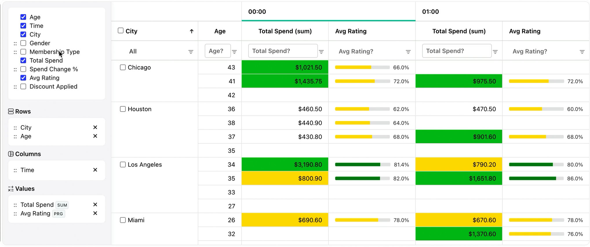
RevoGrid Pivot
RevoGrid Pivot brings this pivot workflow into web applications.
It is a RevoGrid Pro Advanced pivot grid/plugin for embedded analytics. The pivot functionality extends RevoGrid's high-performance grid layer, so the same application can support flat tables, grouped views, and pivot analytics without sending users to a separate reporting tool.
RevoGrid Pivot supports:
- Drag-and-drop dimensions for rows, columns, values, and filters.
- Built-in aggregations such as sum, count, average, min, and max.
- Custom aggregators for business-specific metrics.
- Nested row and column groups.
- Subtotals, grand totals, and custom total labels.
- Heatmap cells and custom cell rendering.
- Drill-down and persisted pivot state.
- Excel and CSV export for report workflows.
- Client-side pivoting for responsive in-browser analysis.
- Server-side pivot models for larger or remote datasets.
It works with React, Vue, Angular, Svelte, and vanilla JavaScript through RevoGrid's grid and rendering layer.
If you are building a product where users need to slice, group, aggregate, drill down, and export data, a pivot should not be a separate BI island. It should feel like part of the application.
That is what RevoGrid Pivot is designed for.
Try the RevoGrid Pivot demo to see how pivot analytics can work inside a web app.
The Short Version
A pivot table helps you turn raw rows into answers.
Rows and columns define how data is grouped. Values define what is calculated. Filters define what is included. Aggregations turn many records into summaries.
Use pivots when users need to compare, explore, drill down, and ask new questions. Start with one clear question, keep the first view simple, and add complexity only when it helps the answer.
That is why pivots are one of the most useful interfaces for data-heavy products: they let people move from "I have a table" to "I understand what is happening."